Colorful futures
An interview with Adam Rowe, the guy behind 70s Sci-Fi Art project and author of Worlds Beyond Time.
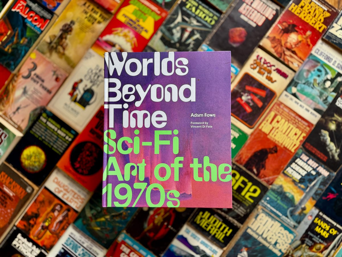
For a number of years, I've been following 70's Sci Fi Art, a project by Adam Rowe, on various social media platforms. In 2022, he released a fantastic art book, Worlds Beyond Time: Sci-Fi Art of the 1970s, which collected those various online musings into one place. (You should also sign up for his fantastic newsletter.)
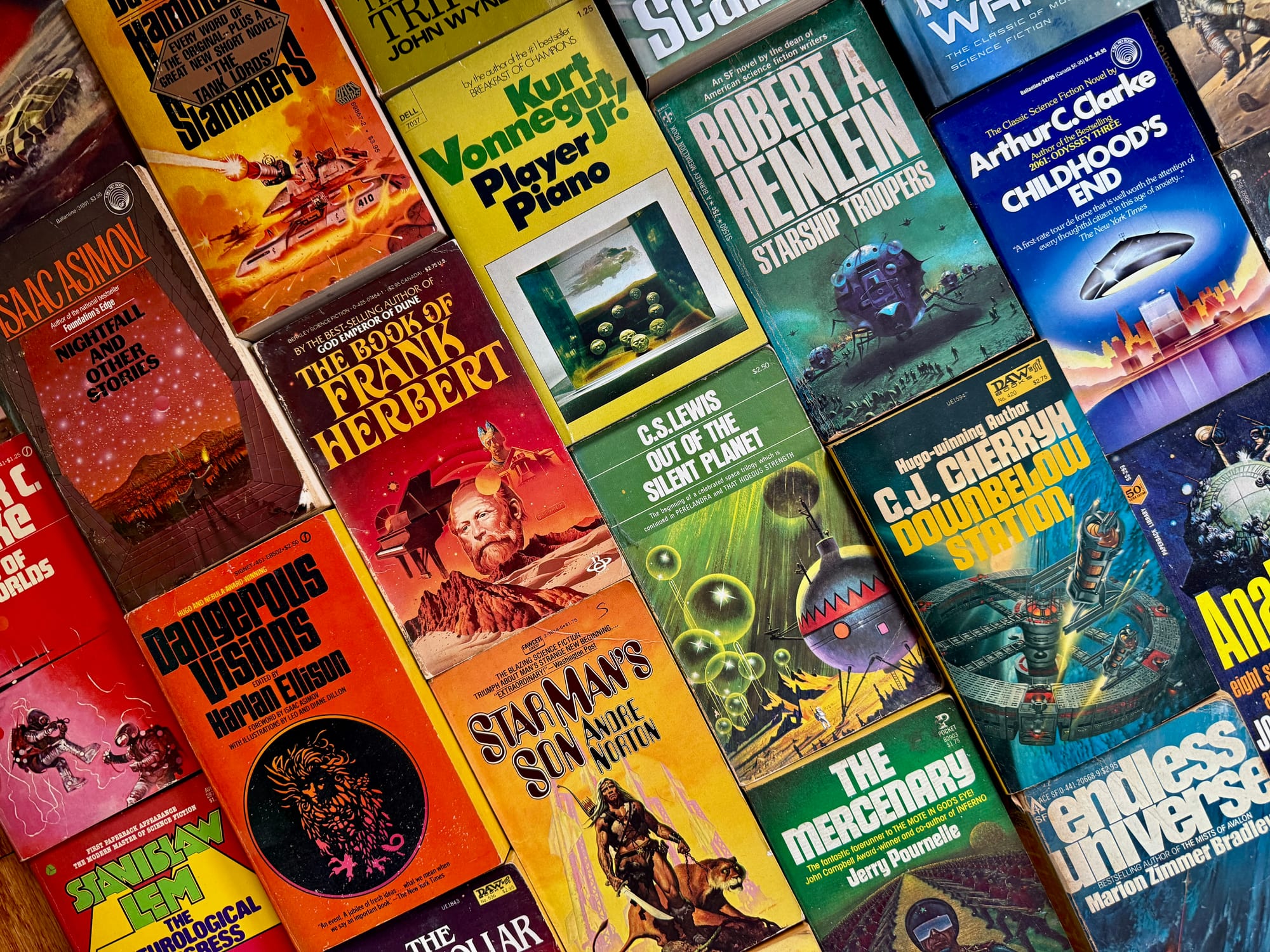
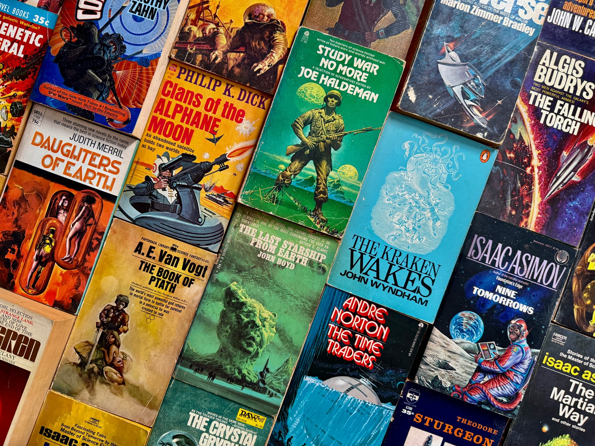
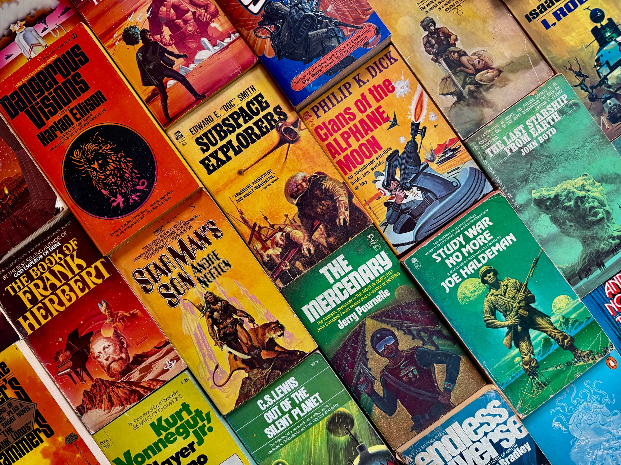
If you haven't come across the project before, it's a great distraction on social media: picture after picture of the genre's most colorful and psychedelic age, with some great insights into the artists, editors, and works of the period around the 1970s, with some bleed-over before and after.
Adam wasn't deterred by my tardiness, and agreed to answer my questions about it. Here's my interview with him.
Your project started off as a Tumblr account called 70s Sci-Fi Art. Was there a particular cover that grabbed you and started you down this path?
I started my Tumblr way back in April 2013, when I was in the final weeks of a Spring semester at college and had a little free time to mess around online. I found a Reddit post featuring an uncredited, unpublished artwork done by a soldier stationed in Germany in 1977. I loved the style, and I tried finding more similar art.
It’s kind of a familiar origin story for online creators: When I couldn’t find the exact blog I wanted, I decided to just create my own. That uncredited artwork was my first post. 12 years and 33,000 posts later, I’m still finding interesting new art.
What was the early response to the blog like?
My Tumblr took off pretty quick! It turns out that a lot of people liked the same era of art that I did, and I think it really helped that my handle doubled as an explanation of what people would get if they followed: “70sscifiart.”
I also posted a lot! I was posting at least seven times a day for years and years, although I’ve cooled down a lot recently. It turns out getting hyperfixated on a special interest is really the cheat code to social media success, or at least it was in the 2010s.
You expanded this project onto Twitter and a bunch of other social media platforms and you've gained a pretty big following: what is it about this project that appeals to so many people?
This era of art just resonates with a lot of people. Some of it’s standard nostalgia, some of it’s a nostalgia specific to a past in which we were a lot more optimistic about where the future could take us. And I think a lot of it is a response to the type of rich, thoughtful cover illustrations that the US could produce half a century ago, when it was at the peak of a pretty strong economic run.
I get a lot of artists, designers and video game devs following me, too. I think a lot of art and media these days is based on remixing older styles and genres. But no one wants to get stuck making a copy of a copy of a copy, so having one art blog that pulls together the source material behind a certain style is a great resource.
Despite the name, this project doesn't cover just art from the 1970s – artists like John Harris and Michael Whelan are still working – what is it about that particular time period that really stands out to you?
Yeah, I named the blog "70s Sci-Fi Art" and then I kept finding and posting cool art that wasn’t from the 70s. Long-term followers of my blog will know that I’ve redefined “70s” to mean anything from about 1959 to 1991. I can understand if that upsets anyone who feels that words should mean things.
The truth is that I like a certain tough-to-define colorful, analog, science-fantasy vibe that felt more specific to the 70s than just “retro sci-fi” in general. I’m not nearly as interested in the science fiction magazine art that was around in the ‘20s-’50s, for instance, so I like centering my focus on the 1970s as a focal point, even though I’m interested in following the trends that were biggest in the 70s across the 60s, 80s, and beyond.
Something that I've noticed throughout the history of science fiction and fantasy is how people complain that the covers don't always line up with the text they're promoting – the unauthorized ACE editions of Lord of the Rings was one memorable example, while other covers are pretty abstract. There's something of a disconnect between the reader or author's image of the story and characters, and what the artists produce.
Yeah, that’s a really interesting discussion! The truth is that you can’t really boil it down: There are a lot of factors that go into the differences between the covers and what’s inside them.
Some of that is down to the artist. Some artists really do take a lot of care to represent the story as closely as they can - Michael Whelan has done that his whole career. Other artists are too busy to read the stories they illustrate - Chris Foss has been pretty vocal about rejecting the hypothesis that he should be expected to (and it’s hard to argue with that, given he was creating a blistering two or three covers per week back in the day).
Most of it is just how the art director or publisher wants the book to be marketed, of course. The conventional wisdom for selling science fiction in the 1970s was to focus on spaceships or planets, even if the stories didn’t. Sometimes artworks that were clearly designed for a specific story would be recycled for another one they didn’t fit at all - one infamous example being the 1975 Bruce Pennington cover of Philip K. Dick’s The Three Stigmata of Palmer Eldritch, which features the ornithopters and spiced-up blue eyes that Pennington had clearly painted for his Dune cover in 1968.
Vincent Di Fate has a fun story about how the space station on his 1993 cover for Robert L. Forward’s TimeMaster would have looked “suspiciously like a garbage can” if he actually followed the dimensions in the text, so the publisher made sure they went with a “more conventional” torus shape in the end.
Personally, I don’t care too much about book-accuracy. It’s always nice to see, but some of the best covers are completely original works.
What is your process like for posting this artwork? Where do you source your images from, and what types of research do you do when you write up a post?
I always try to cite the artist if at all possible, and often the author and title that the cover art was first created for. 99% of the time, I can find that information on ISFDB.org, which is a sort of a Wikipedia for sci-fi and fantasy books. It’s an incredibly valuable resource (I already linked to it once in this interview, which tells you how often I turn to it).
Nearly all my images are sourced from somewhere online. Back in the day, I used to use Google’s Image Search for almost all my research: I’d find a trove of illustrations from one artist and save them all in my drafts, and then sprinkle them into my Tumblr queue so that I wasn’t focusing on only one artist for a long time. These days, Google isn’t quite as good at finding new art, though. They changed the whole process sometime around 2020 to use Google Lens instead, and these days there is a lot of AI slop that I have to avoid.
How did the book come about, and what was the writing process like?
My literary agent Sarah Bolling reached out to me first back in 2018, saying she liked my Tumblr and wondered if I’d ever consider a coffee table book on the subject. I had always thought a collection would be cool to do, but I probably wouldn’t have ever reached out to an agent about it myself, so this whole book wouldn’t have happened without her. She’s since left the industry, sadly! If any literary agents reading this wants to represent me, get in touch.
We landed the book deal at Abrams in September 2019. The actual process was tough for me, though, and I had to push the deadline quite a bit until I eventually finished in December 2022. I just faced a lot of paralyzing anxiety over the process – I would find myself freezing up for months at a time. It’s obvious in retrospect that it was a form of anxiety, probably largely due to the huge number of artists that I needed to contact and win over in order for the book to work. But at the time, I had the impression that anxiety manifests as a frantic frenzy rather than a shutdown. Turns out it can be both or either!
One of the things that I've been enjoying about the online project and the book is how you pull some really specific tropes out, like "reflections in spacesuit visors," "space skeletons" or "cats": what do these themes say about the types of work that this group of artists was producing, and what do you think it says about what fans were looking for?
One of my biggest inspirations for the format and tone was Grady Hendrix’s Paperbacks from Hell, a rambunctious illustrated history of ‘70s and ‘80s horror novels. That book uses the same “goofy themes” concept to tie together a lot of wildly different books, and I really loved it. It’s such a smart way to efficiently condense a sprawling history while highlighting fun or outlandish tropes.
As for what the themes say: Everything! It’s too much to sum up. You picked three of my favorites, though, and they demonstrate a good breadth of the meaning to be found in grouping tropes.
Reflections in space helmets are a great way to put the viewer in the astronaut’s boots by depicting the astronaut and what they’re seeing at the same time; reflections are good visual storytelling. Skeletons in spacesuits are (in part) a holdover from the genre’s roots in adventure stories that would often include skeletons in deserts or long-lost islands.
And then there’s Space Cats. I had a lot to say in my book about all the ways cats have turned up in sci-fi illustration, but at the end of day, not every trope has to have a deeper meaning behind it. A lot of people just really love cats. I can’t blame them.
The art these artists produced isn't just art for the sake of art: there's a promotional component to it. How do you think that restricted or constrained these artists? Or did it?
It definitely did constrain them! Plenty of great science fiction artists have been open over the years about enjoying steady work more than the genre itself, from Richard Powers to Chris Moore.
Other artists loved the genre but chafed against the standard “spaceships or planets” box that some publishers would force them into. One example that always comes to my mind is Jeffrey Catherine Jones, who has talked about preferring muted colors rather than the industry-imposed bright, saturated look that publishers thought would draw a customer’s eye faster.
Looking over this vast gallery of artwork, what do you think makes a good work of art for a book cover?
In general, I love a lot of tiny details within a colorful, sweeping, epic scene of something truly alien, like whatever’s happening on Bruce Pennington's 1972 artwork ‘The Plains of Tartarus’ or Roger Dean’s ‘The Ladder.’ That said, I’m constantly blown away by dozens of other types of illustrations. Rick Sternbach’s depiction of a dolphin in a functional spacesuit is hardly epic, but it’s so delightful I did a whole interview with him about it. I guess I just like seeing art that’s a little different from anything else I’ve seen before.
Given the turmoil of social media, what is the future for this project? Do you have any other projects coming up next?
I’m still posting occasionally on all my social platforms, but the most fun I’m having these days is with my newsletter, where I’m posting a weekly roundup of art – mostly grouped around themes that are even more offbeat than the ones you’ll find in my art book! Spherical Red Aliens, Giant Teeth, etc. If anyone’s interested, this link has all my social media and ways you can buy my book.
There is one art collection that I’d love to put together, and I think it could be an incredible book. It’s still very early stages, though, so I don’t want to say too much! It would be slightly outside my normal “retro science fiction” lane, though. It would focus on a single artist, too, which gets rid of all the licensing anxieties I had with Worlds Beyond Time. Or I hope it will. Fingers crossed.