Iterate, iterate, iterate
How the latest book cover from the Vermont Historical Society came together
Last month, I published an interview I conducted with Jeffrey Amestoy, the author of the next book from the Vermont Historical Society: Winters Time: A Secret Pledge, a Severed Head, and the Murder That Brought America's Most Famous Lawyer to Vermont. I'm excited about this one: we're releasing it on September 16th, and it's something a little different from the books that we've published in the recent past: it falls a bit more into the true crime and legal thriller category. It's nonfiction, but it's a slick and well-written narrative that reads a bit like a novel.
In what's becoming something of a series, I've been jotting down notes for the last couple of months as I helped design the cover for it. Last fall, I wrote about how the design process for our book Ira Allen: A Biography played out, and again this spring when we released Life Became Very Blurry: An Oral History of COVID-19 in Vermont.
Going into this particular project, I realized that this was going to be a very different sort of book than the others. I've been describing it as a true crime and legal history that explores a particularly dramatic episode of Vermont's history – a far cry from the "Dad history" that is Ira Allen: A Biography and the in-the-moment nonfiction document that is Life Became Very Blurry. Both of those books needed covers that conveyed different things: the subject for Ira Allen and a stark image for Blurry. Winters' Time would need something a little different.
Because this cover has to accomplish some different things, I started looking through Amazon and Bookshop for "historical true crime" to see what types of covers popped up. There are a lot of different variations for that, but something that jumped out at me wasn't a book, but a podcast cover for Dark Down East: New England True Crime.
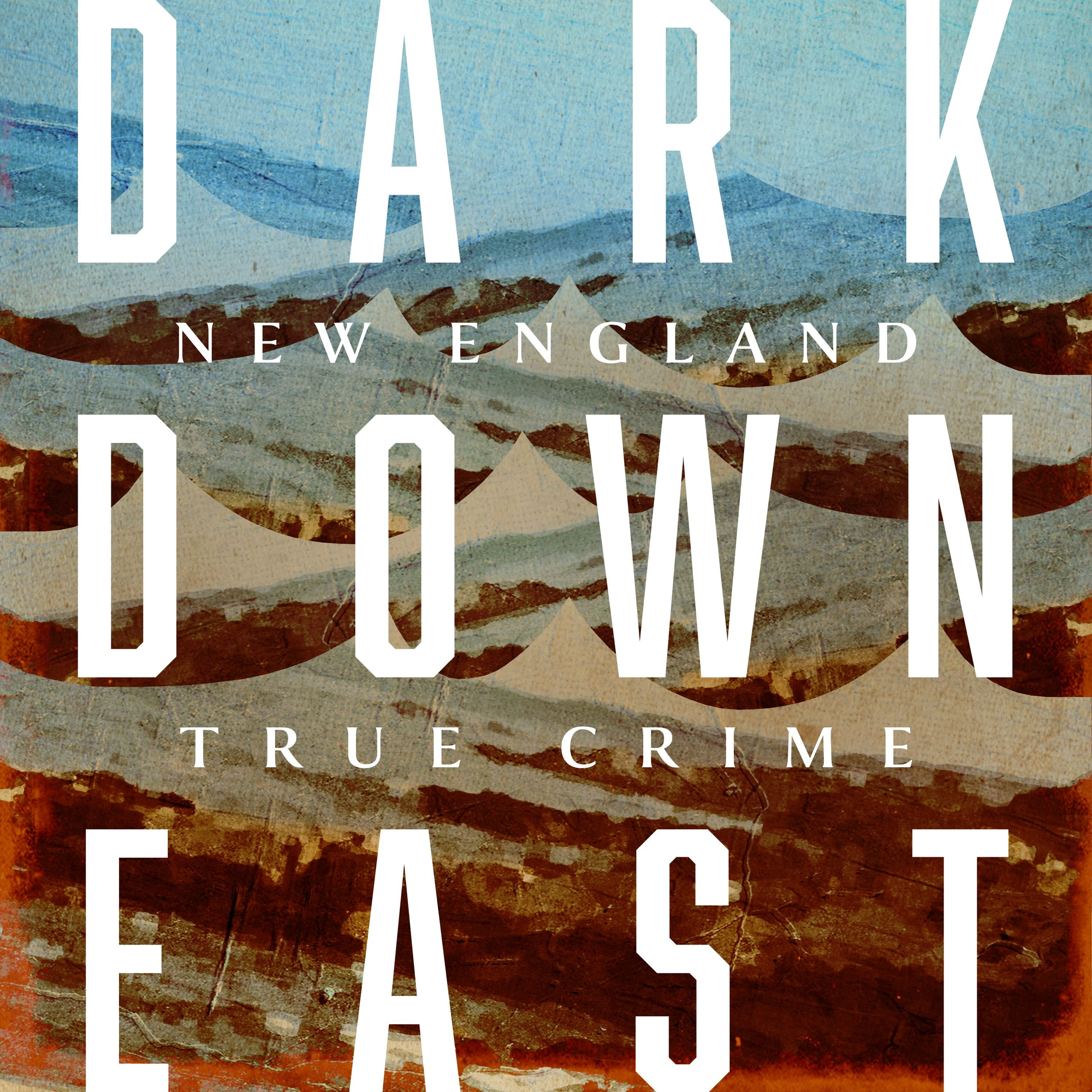
What I liked about this cover is the big, bold type. It wouldn't exactly work for our book, because the words that make up our title and subtitle are long, but I liked the vibes it gave off.
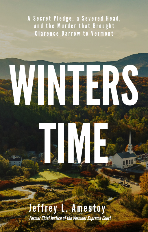
For my starting point, I went back to Blurry and swapped out some images of Windsor, where the crime in question took place. I also decided to fiddle with the subtitle a bit to get a feel for what worked.
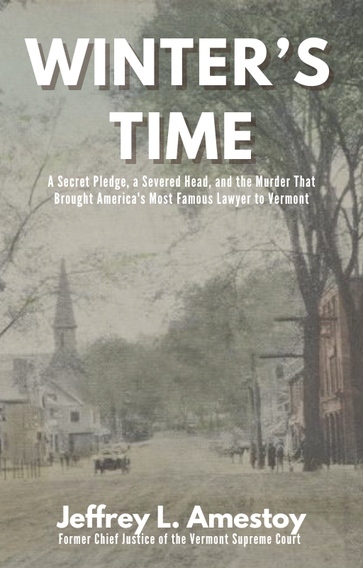

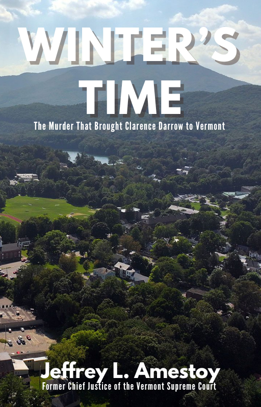
The first couple of attempts that I made, with images based on the town of Windsor, where the murder took place.
Those first versions were... not great: the images aren't the most inspiring and where for Blurry we had a central object in the middle, this layout meant that there was a big hole in the middle. And these images don't really convey anything about true crime. So, into the trash can they went.
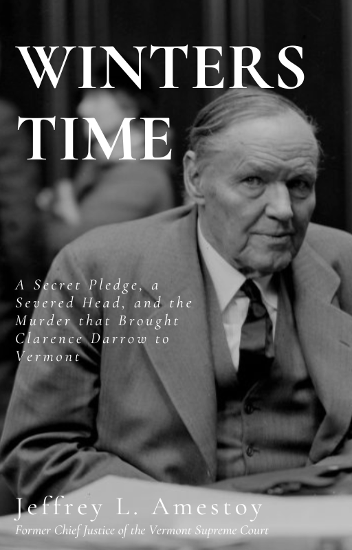
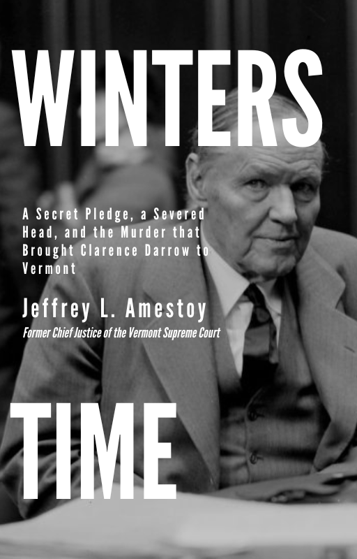
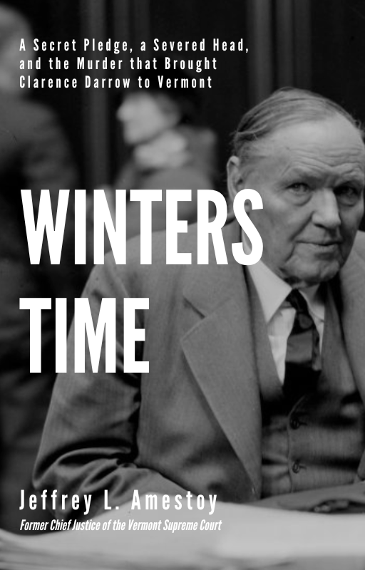
Doing some googling, I came across a very lucky break: Darrow was actually photographed during the trial that the book is all about. It's a good image, too: stark and historical, which I thought suited this sort of book nicely. And, with Darrow in the center, it let me keep roughly the same structure: title on top, subtitle, and author's byline at the bottom.
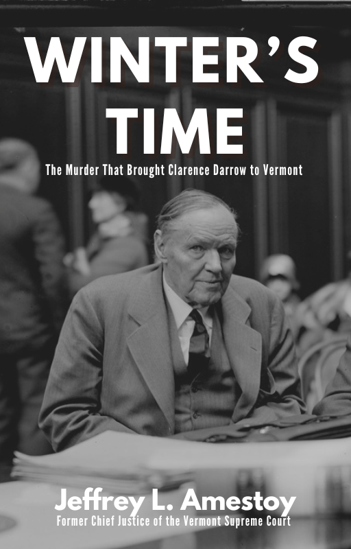
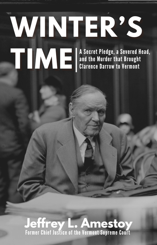
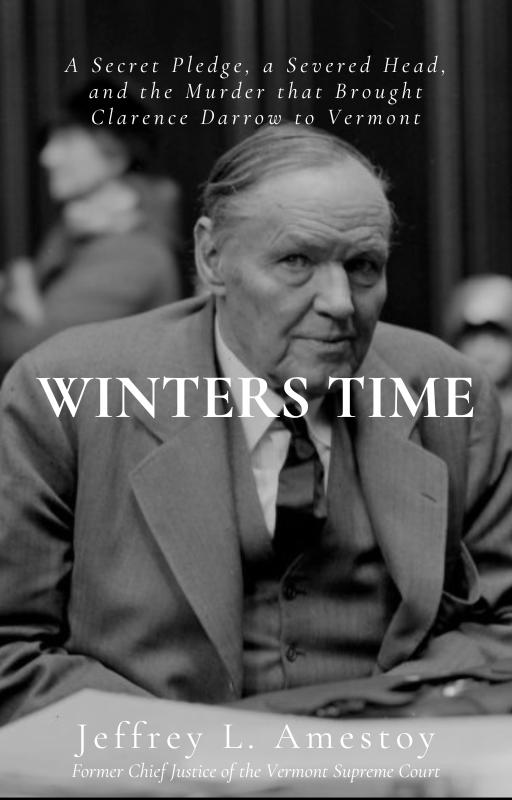
A trio of early covers featuring Clarence Darrow
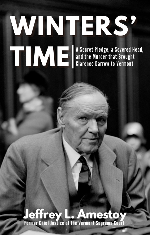
I played around with a handful of variations on the title and subtitle: this version felt a bit more historical than true crime, but I liked the overall look. My wife's response to all of these were: "these are boring" and "why on earth would you remove the words 'severed head' from the subtitle?"
"Severed head" went back in.
I took a break from this project to focus on some other things, but as the production date moved closer, we returned to it in earnest over the summer. This is where we brought in Amestoy, who liked the image of Darrow. With a couple of months to mull it over, I decided to put together some alternatives. I started with the same elements, but with something a little more formal, based loosely on the cover for Starkweather: The Untold Story of the Killing Spree That Changed America by Harry N. MacLean:
One of the issues that I began to find was that there were three big blocks of text that we needed: the title itself (two words of differing length), a longish subtitle, and the byline and its subtitle. Placing those in a way that made sense was proving to be troublesome, especially with a subject right in the middle.
I tried a couple of alternatives: one with the title off to the side, another in the middle, and another with some graphics providing some needed negative space. They all give the right vibe, and I like the change in font: it feels al little more refined and historical, and less sensational.
But this is a book that touches on legal history and true crime and I was starting to find this version is a little dull: when I sent a batch of covers to some friends that I've used as a sounding board, these versions didn't really stand out all that much.
So I went back to scanning through other books for inspiration, and liked what the designers did for Michelle McNamara's I'll Be Gone in the Dark: One Woman's Obsessive Search for the Golden State Killer and Daniel Sweren-Becker's Kill Show: A True Crime Novel, featuring big, bold text for the title.
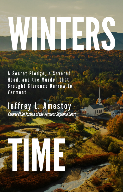
Those were dramatic and looked good, but didn't have a central subject: the covers convey what they're about with the image and text for a vibe. So for this round, I decided to add in some other images, on the off chance that we couldn't license the image of Darrow. I searched through Unsplash for "Vermont" and found these two photographs that I thought would work well.
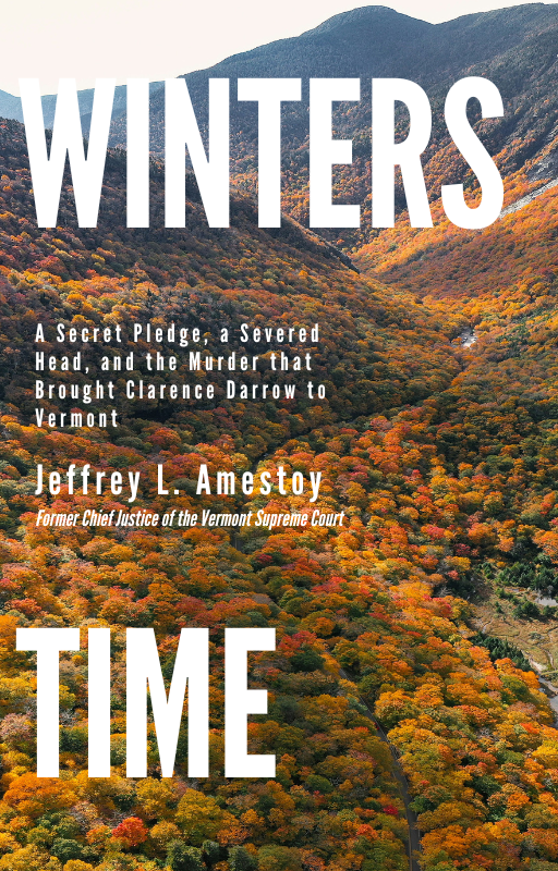
I decided to change up the text for this round, splitting the title and sticking the subtitle in the middle to see how that looked. I liked parts of it: The bigger font size helped distinguish the title, while the subtitle and byline worked pretty well in between the two.
But my colleagues weren't a huge fan of that split title, so inverted it: I put the title in the middle, the subtitle at the top, and the byline at the bottom. I also ditched the foliage image: it didn't convey the right feeling to me.
The image with the town really popped with this layout: it neatly telegraphs Vermont without feeling too boring. I also wanted to see how it would look with the Darrow image as well, so I came up with a pair of versions: one with the title dead in the center, and another with the title offset to the left a bit. It still feels very "true crime" but historical at the same time. My sounding board and colleagues also keyed in to the first image as well. We had found our cover!
Except we didn't.
We ended up rejecting it: Amestoy wanted to retain a more historical and accurate image (the image is of Stowe, not Windsor), and while I found a similar image of Windsor that we could likely figure out how to use, we quickly realized that this more contemporary image leaned more into the true crime vibe than it did historical legal story that we were looking for.
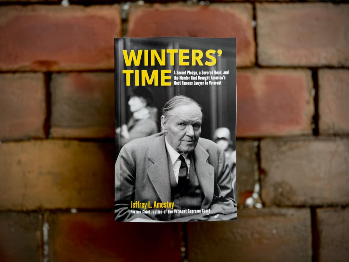
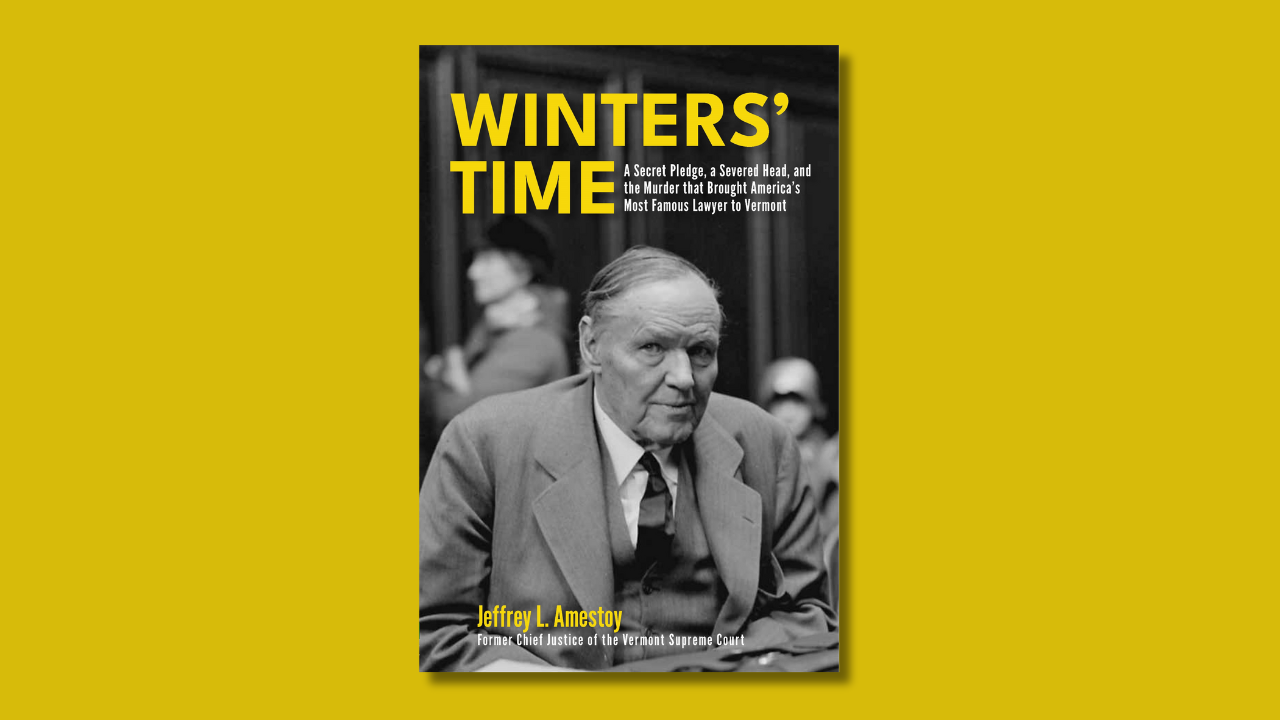
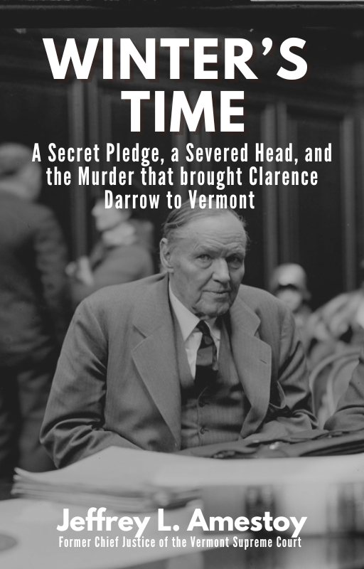
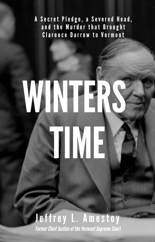
So: back to the drawing board. After a little back and forth, we decided to rewind and go back to the Darrow image, and I secured permission to use it. With at least the image locked in, we could figure out how to place the words around its subject.
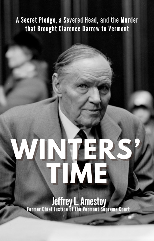
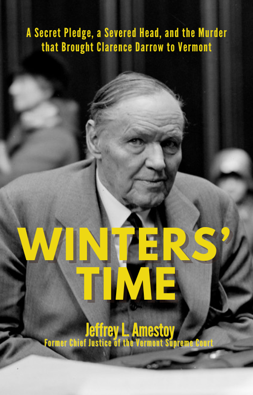
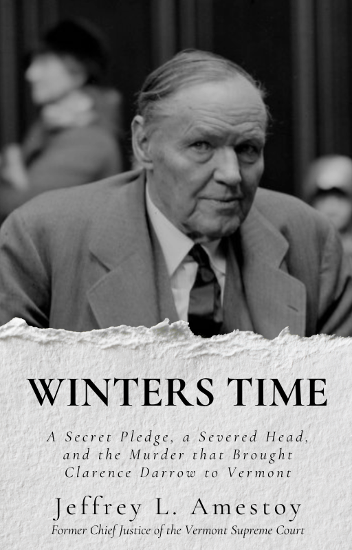
Amestoy liked one of the original title configurations, so I redid it, adjusting the colors and layout a bit, and came up with a new version: the title with the subtitle tucked into it, with Amestoy's name at the bottom. I also toyed with some of the other things that I liked with the town version: the title in the middle, but it became pretty apparent that we needed the middle uncluttered with text.
On a whim, I wanted to see what it would look like with a bit of color: white on a black and white image felt very stark to me, and running through a bunch of different colors, a rich yellow-gold really worked for us. The color looked good, but we wanted some variation to differentiate the title and subtitle, so we decided to keep the subtitles white while keeping the title and byline yellow.
From there, we handed everything over to Jim Brisson, our designer, who whipped it into shape:
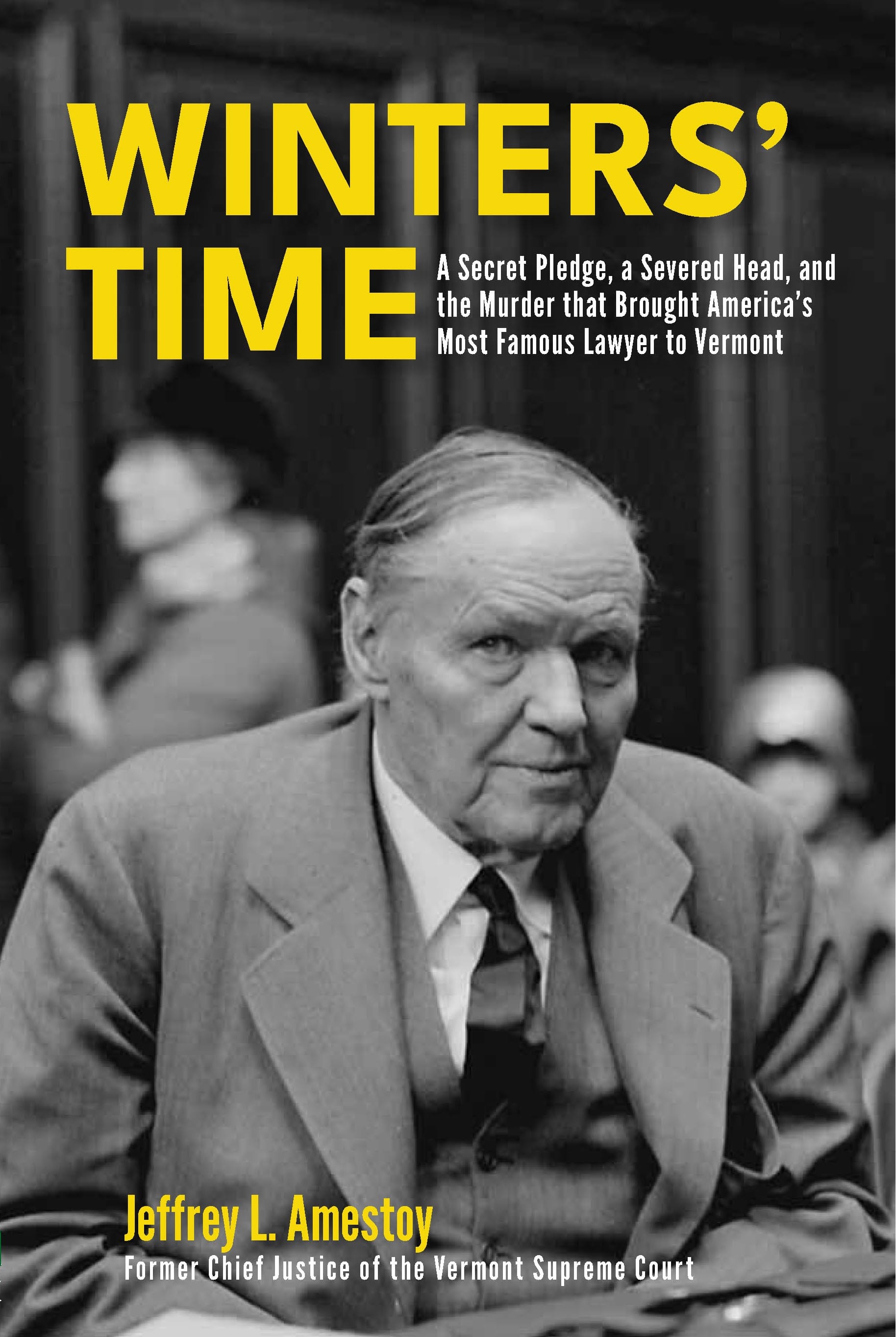
I'm pleased with how this came out: it feels historical and captures the feeling of this book without coming off as overly sensational or dramatic (the subtitle carries that dramatic weight nicely.)
What I appreciate about this particular cover was the iterative process: we went through a lot of different ideas to get to this final one, trying out a whole bunch of different directions before landing on the final version. Ultimately, I think we went through 20-30 different versions before landing on this one. It's a good reminder that sometimes, these things take time to sort out the kinks and issues, and that it's good to take that time.
That final version was close to one of the earlier prototypes that I put together, and while we ultimately circled back to it, I found the entire process to be useful: taking in our author's input, and the input from a wider range of book-minded friends, booksellers, and colleagues, and figuring out which elements worked well with the image, and which didn't. Looking at the final version, I can see the lessons that we learned along the way embedded in there: how the title and subtitle work together and how the image conveys the subject and vibe for the whole package.
And, while I still really like the version with the town in it, I can appreciate how switching out the image can change the tone of the entire book, which will ultimately shape how people will approach it when they pick it up off a bookstore shelf. And who knows? Maybe we'll return to a variation on that at some point.
The book will hit stores next week, and I'm pretty pleased with how the final version looks. Moreover, I'm excited to see what people think about it when they pick it up. And soon, we'll move onto the next one, which I'm super excited about and already have some ideas for what that might look like. Stay tuned.