Cover Art
How I photograph books and covers
I’ve had a couple of people ask over the years about what I do for book photographs, and I figured it would be a good excuse to talk a bit about my approach to using images in reviews.
When it comes to reviewing and general commentary, I feel that photos and covers are important, for three reasons:
- Covers are integral to “discoverability” when it comes to a book: they help grab the attention of a reader, and provide some visual clues to convey the general tone and feel of the book to them.
- That works in a reviewer’s favor as well, because a reviewer wants to get eyeballs on their work, for all of the reasons that people promote things on social media and the web.
- Finally, they’re part of the entire package. The quality of the writing and story are certainly first and foremost when it comes to a book, but I don’t see them as the only important parts. The cover is part of the entire package or product, and I feel that dedicated readers like having something that looks good on a shelf.
I’ve been reviewing books for a long time, and my approach has changed over the years. Initially, I’d just use some coding for the cover art at SF Signal (RIP), and at io9, I’d use a selection of the cover art, because it often made a good header image. Sometimes, it works really well, especially when the publisher allows the artwork to really speak for itself.
For example:
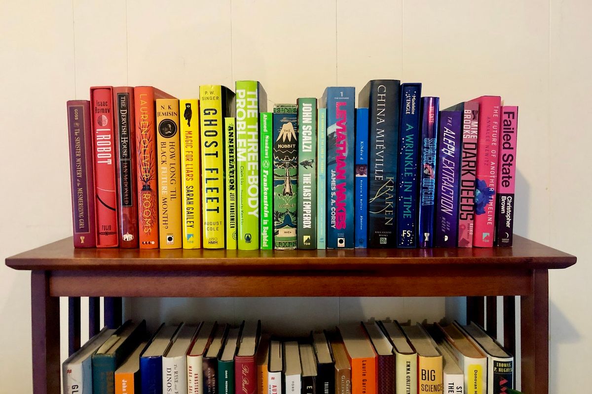
Over the last couple of decades, I feel like we’ve had a bit of a shift in book cover styles: a preference for text-heavy covers, which help convey a book’s title and author to a digital shopper who has to look at tiny thumbnails.
That’s not to say that these types of covers don’t look good: far from it. These are all really striking, and the cover designers do a superb job using typography to convey everything that needs to be conveyed to the reader with the fonts, background images, and colors.
Part of this, I think, comes from the evolution of the book cover throughout the 20th century. Science fiction came from pulp magazines, which required garish and beautiful artwork to stand out to readers on magazine stands. The early magazines provided wonderful canvases for some beautiful and vivid artwork, and when paperback novels became a thing in the post-WWII world, those artists came over from magazines to books. Science fiction really retains that tendency, using the art to directly signal to the reader what type of book they’re getting. (This isn’t necessarily limited to SF/F works, but it’s certainly apparent here.)
In many ways, that makes it easy for the very specific purpose of showcasing books whether it’s an online review or post to Facebook, or to display in one’s home.
I began to change up that style in 2017 while I worked for The Verge. James Bareham, then the art director for the site (and now for all of Vox Media) was instrumental in my thinking here: we had a lot of conversations about how to showcase books. The initial result was a bit of a scene, designed to show off the book as an object, with items thrown in for flavor and to signal to readers what the tone of the book was, and that there was something tangible about the work that goes into reviewing.
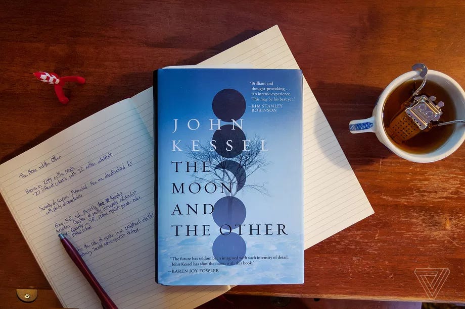
Photo by Andrew Liptak / The Verge
The result was a scene that included a couple of things: the book itself, a cup of tea (because that goes really well with reading), and notes that I took while reading the book. My robot tea infuser was hugely popular — I got a lot of email from readers asking what it was, and where they could get it. (Here you go)
I really like this format, and I used it a number of times while I was there. Some worked better than others. Working with the team there, we established a look for other pieces in the section that I was dumping most of this work, like lists or interviews or excerpts of books.
For book lists, I took a stack of upcoming books to the counter of Bear Pond Books in Montpelier to shoot them, first as a stack, then standing up. After a while, I started to experiment a bit. For my review of Gunpowder Moon, I bought a back of concrete and spread it out on a large sheet of cardboard in my living room and set up some bright lighting, to try and replicate the surface of the Moon. For Michael Crichton’s novel Dragon Teeth, I buried it some dirt and revealed the title. I’m very happy with how that one came out.
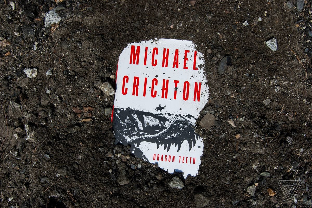
Photo by Andrew Liptak / The Verge
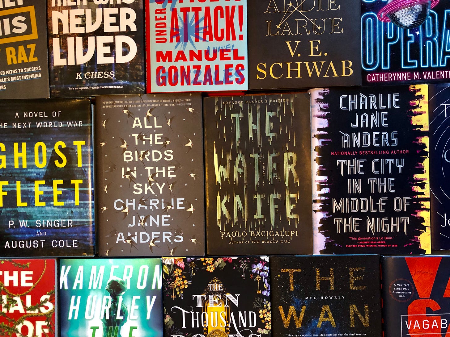
For the best books of the year list, I’d pull all of the ones that I had off the shelf and create a mosaic. I’d still cut out cover art in instances where I didn’t have the physical copy — or if there wasn’t a physical one. Finally, we’d do something similar for author photos when I took pictures at conventions — having an author hold the helmet of a character that they wrote about is pretty cool. (Christie Golden’s picture was a fantastic set of coincidences at SDCC in 2017 — we were talking out to take her picture, and we happened to run right into a 501st member dressed as a member of Inferno Squad. Of course we stole them and their helmet — the trooper was THRILLED that we had the author right there.)

Photo by Andrew Liptak / The Verge
(I still think this is one of my favorite pictures that I took for the site.)
Eventually, I shifted to standing the book up on its side for reviews, matching the book roundups. That mainly came down to time and effort — setting up a tiny scene was time consuming.
Ultimately, what all of these images do is convey some element of the book to the reader, in a more effective way than simply using the cover art. I try and think of books holistically: they’re not just something you read: they’re objects you display on a shelf, that you like to look at, or if you display them right, they’re like a tiny art gallery. How you feel when you hold the book while reading it is part of that reading experience, at least for some readers who like physical copies.
Plus, photographing the books yourself gives you some original content that isn’t replicated anywhere else. It’s easy to pull cover art for a book and throw it in there, but there are a lot of sites that do this, and it helps distinguish yourself a bit more. I know this approach works: I saw places like the Barnes & Noble Sci-Fi & Fantasy Blog and Tor.com begin to do something similar with their work.
So, what’s my approach?
At The Verge, I used a basic Nikon D40 camera, which I’d haul out and take 2-3 dozen pictures with, from which I’d select the best and send off to the photo department, who’d work on their magic and make it look pretty. Now that I’m on my own, I don’t have a department to lean on for help with this sort of thing.
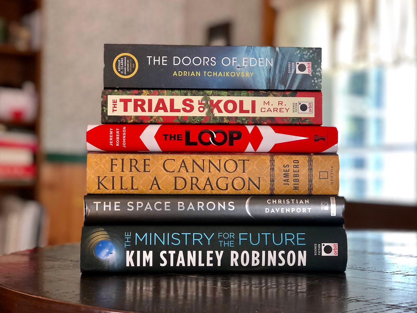
I’ve largely kept the same design style for this newsletter: I still try and look at the entirety of the object, and I think that this helps make them stand out a bit better. I tend to select books that go well together for book roundups, or play with lighting a bit when stacking them up for a picture:
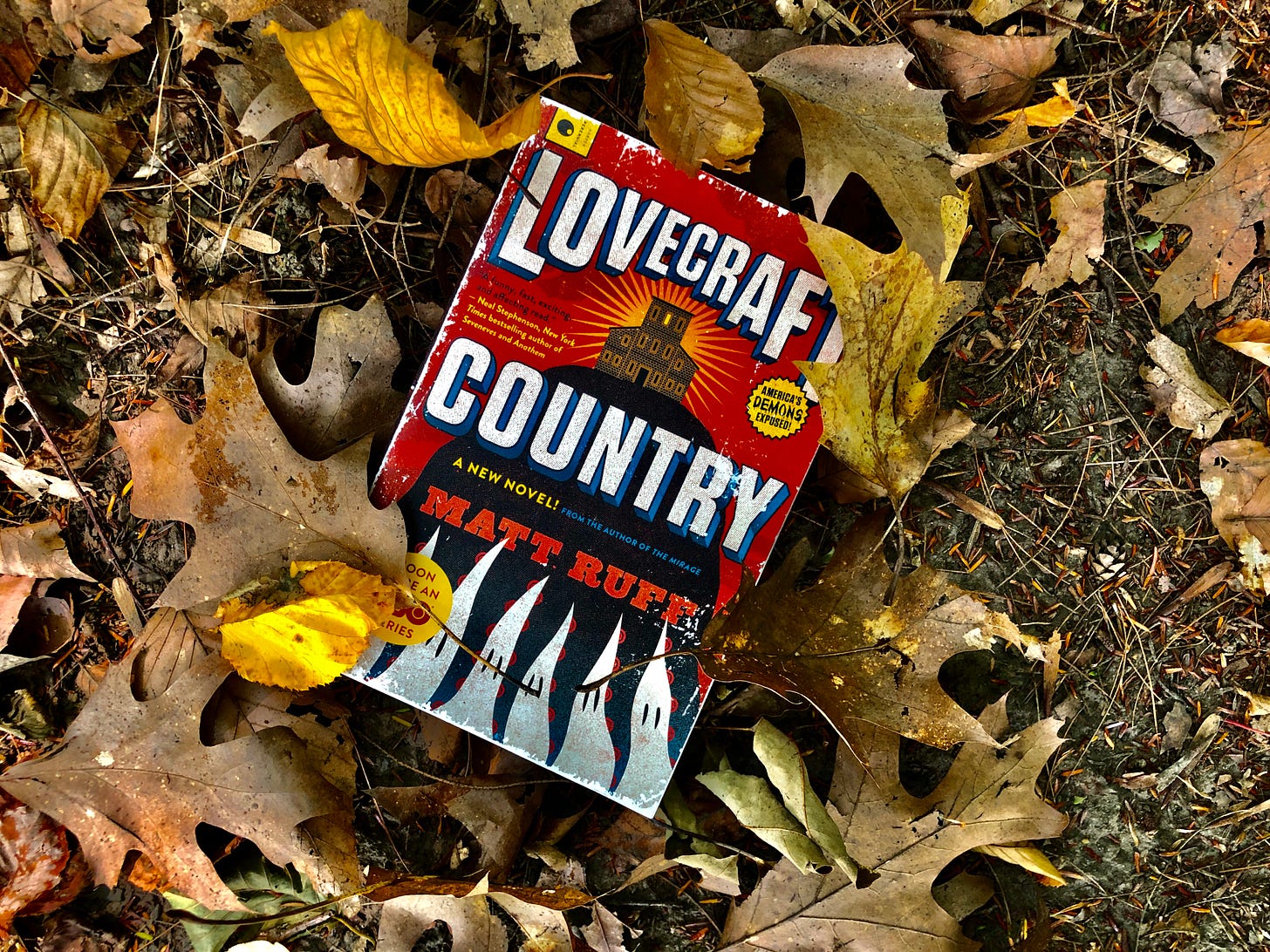
In other instances, I work to try and convey a book’s atmosphere in the picture. For the recent Matt Ruff interview, I took my copy of Lovecraft Country out into the woods, and tried to convey something of the fall / gothic atmosphere. For composing this shot, I worked to find a duller background that made the red in the cover pop out.
This sort of thing doesn’t take a lot of time, and the key reasoning behind this happens before the picture is taken: compose the scene and shot in your head ahead of time, rather than just slapping down a book(s) and taking a picture. Think about the lighting and how that can change how the cover looks. Think about the angle that you’d shooting from, and how that makes the book look. These decisions collectively tell the reader / viewer something about the book itself.
What I’ve been doing for quick, throwaway shots of books that I’ve received for Twitter is use my iPhone 8 Plus. Book covers shoot well in portrait mode (there are some definitive lines and edges that the software likes). Most everything I do these days is on my iPhone or iPad: they make it very easy to do post-production work right on the device. I don’t usually do much: I usually just drop the black point and enhance the colors to make them stand out a bit more.
I’m certainly not an expert here: cameras confound me, and I can never really remember how to work most of the settings. It’s something I’m working on. But, this is an approach that I’ve found to be extremely useful, and it’s something that I enjoy doing.
As always, thanks for reading. I’d like to hear from you: what’s important to you in a book cover, and what is your favorite cover? Does it figure into how you enjoyed the book?
Andrew