Judging the covers
George R.R. Martin's A Song of Ice and Fire is getting some new covers, and they're a good example of the importance of striking art and the limits of minimalism design
I like cover art quite a bit. I often think about books not just as bricks of paper and glue containing a story, but as a whole package, of which the cover is an integral part. Covers have the ability to make or break a book for audiences, and I'm always intrigued to see when a publisher decides to go through the additional effort to give a book a new look. Sometimes, it's down to the length of time between books and tastes / preferences have changed. Other times, a publisher has opted to update a popular series with a new look, taking advantage of those changes, looking to introduce them to new readers.

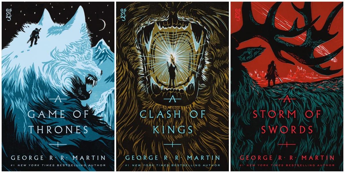
Those big, popular books? Just look at the progression that series like Harry Potter, The Lord of the Rings (so many changes over the years), or Iain M. Banks's Culture series. The latest to get a change in covers? George R.R. Martin's A Song of Ice and Fire, which will come out in October with a series of new linocut covers designed by Mark Seekins with jacket design by Tim Green of Faceout Studio, with art direction by David G. Stevenson.
I really dig this look, especially at a point in time when covers are moving increasingly to minimalist, text-driven designs.
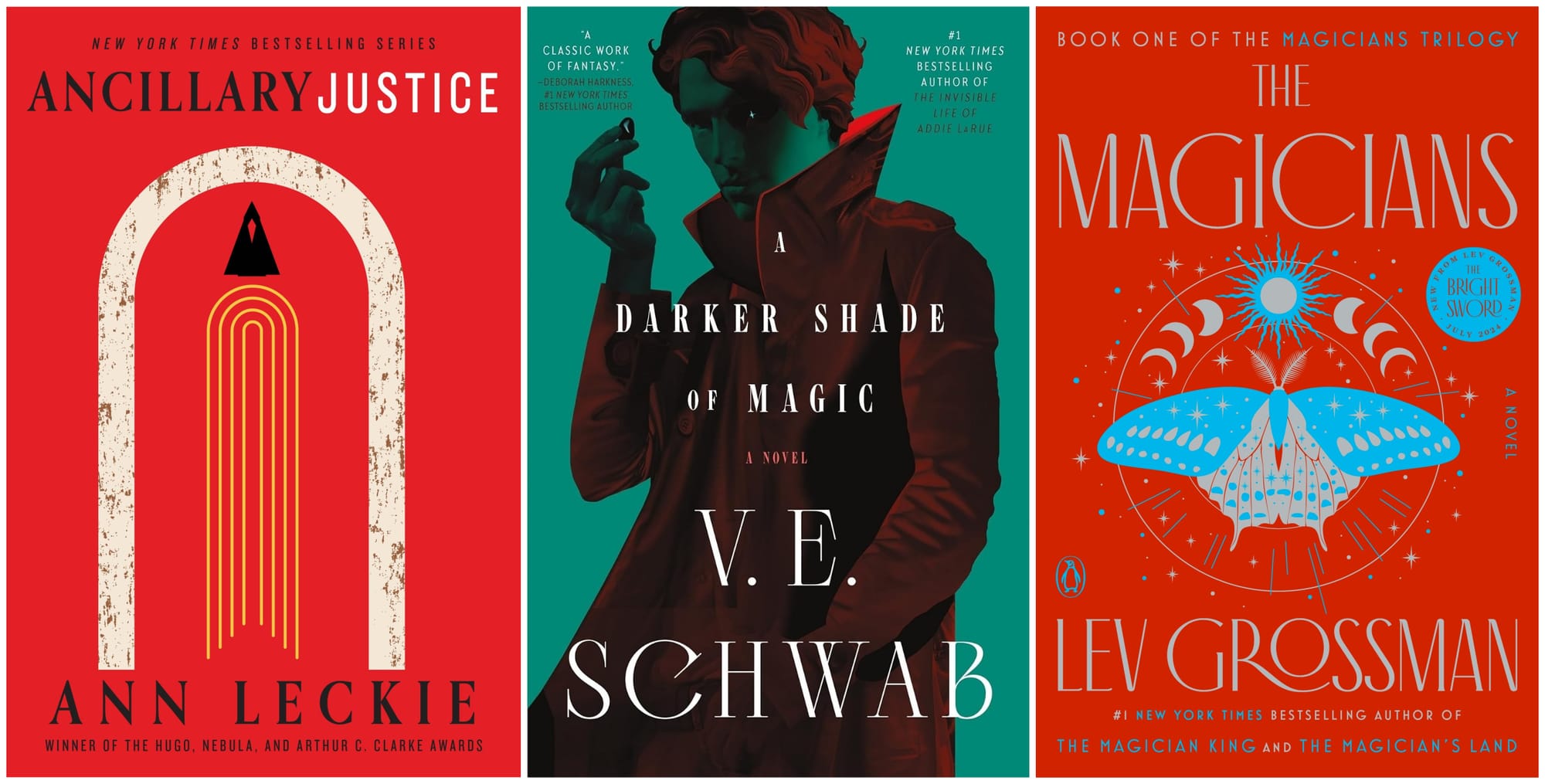
As I noted when I wrote about the changes to Banks's Culture series, these sorts of changes can be hit-or-miss, something that I've found especially true when you start off with a really high point, like Ann Leckie's Ancillary Justice or Lev Grossman's Magicians books. I don't think that this new crop of covers really captures the magic of the books that the originals do, and I'd point to the two Magicians styles as opposing examples of how minimalism can work or not work for the books.
I utterly adored the stark cover of the original book. While it didn't really say much of anything about what the book was about–it fit neatly into the "this is a fantasy novel for people who like real books" design trend of the 2000s–it conveyed a sort of otherworldliness and seriousness that worked really well for this particular story. I don't think the new covers quite capture that.
On the other side of things, Martin's books have always had a sort of minimal presence, starting in 1996 with the release of A Game of Thrones, before leaning a bit of the 1990s-style epic fantasy art before going back to the stark designs for A Feast of Crows (2005) and A Dance with Dragons (2011). Whenever Martin completes Winds of Winter, the cover design has long since moved on to a different style of minimalism.

I've always found the ASOIF covers pretty bland. When I first came to the series, I picked up the chunky 2005-era mass market editions that came out with A Feast for Crows that focused on distinctive colors for each edition, with a simple and elegant typeface and a central house sigil. The last batch of redesigns followed a similar pattern in the style of A Dance with Dragons. None of these covers are particularly inspiring, but they also don't really need to be: the series is already exceptionally well-known, so the need to entice a reader is diminished. Still, if you look through the various iterations of the series covers, they're all pretty boring!
Writing on his blog, Martin explained that they wanted to "capture the vastness of Westeros and the dangerous journey readers will encounter. There is a raw and gritty quality to linocut and woodcut art. A certain starkness that seemed to fit the stories, and a long history to the art form that felt right for this world." I think that these new covers accomplish that: they spell out something about the tone and nature of the series.
If Faceout Studio sounds familiar, you might have come across one of their designers on Instagram, Elisha Zepeda, who's been using the platform to sketch out his work on designing covers. He didn't work on the ASOIF books, but he's part of a studio that's produced some outstanding covers over the last couple of years. In a recent interview with Publishers Weekly, he made a good observation about how and why so many books end up looking the same:
"I also think that seeing a handful of designs proposed—which start out as artistic and inspired, then often are reduced to looking like a knockoff of a bestseller—just gets under people’s skin. The industry corners itself into saying, “This is how big text should be,” and, “We have to be mindful of the tiny thumbnail.” But why shouldn’t book covers look like art? Seeing the visceral response in the comments section makes me feel like I’m not crazy. I’m only spending $30 on a hardcover if it looks like art that I can display. It’s the whole reason vinyl is back today—people want a tangible way to show off their interests. Why not lean into that in publishing? Giving a cover a dime-a-dozen look that will be lost in the oblivion of similar covers feels like a waste. Most of my viewers share that sentiment."
"Why shouldn't this look like art?" is an excellent question to ask, especially when hardcover books are hitting the $30 or $35 mark. Publishers face incredible competition not only from their rival publishers, but from other entertainments like streaming services, video games, and social media. Producing something that stands out and helps capture someone's attention from those distractions has never been more important.
The rise of visual influencing through movements like BookTok does seem to be pushing for greater demand from readers for good design and cover art: as Zepeda notes, readers want to display books on their shelves. (Obviously, there are limits to how far you can take this; I can't help but roll my eyes at a emptiness of a perfectly-curated bookshelf that only exists to serve as a backdrop for a reel on Instagram. I like my personal bookshelves to be a busy riot of colors and styles.) Publishers should take heed and ensure that if they're going through the effort and expense to produce a book, they should be making sure that the thing readers and buyers see first makes a good first impression.
I think that's a positive direction for publishers to go, especially as we're in the early days of an age where generative AI platforms can cook up artwork in seconds, or where designers and publishers chasing trends and come up with something that's indistinguishable from their neighbors on the shelves. Good cover art and design shows intent and a creative spirit from the entire team behind the book, and an outstanding image can help define a story long into the future (look no further than the impact that artist John Schoenherr had on Frank Herbert's Dune series). Readers recognize when there is creative effort put into a project.

That's what really draws me to these new covers for AOIAF. Martin recounts some of the process that went into the design on his blog: "[linocut artist Mark Seekins and designer Tim Green] worked together to develop sketches and carve the designs into blocks of linoleum, where the raised areas were inked and pressed onto paper. The covers feature several colors, which required separate blocks for each color layer. The finished prints were then photographed and incorporated into the covers."
That's a lot of physical and artistic work, but the results really speak for themselves. You can watch a reel on their Facebook page where they show how those layers come together. It's pretty cool to watch. I'm not willing to give up the Folio Society editions that I have of Martin's series (even if it would save me precious inches on the bookshelf), but these are distinctive, interesting covers, and you can't help but take them in, which is what these are supposed to do.