Honoring Ursula K. Le Guin’s Vision: Q&A With Artist David Lupton
A look at The Folio Society's edition of Ursula K. Le Guin's The Dispossessed
Last week, The Folio Society unveiled its latest slate of books, including a new edition of Jin Yong’s A Hero Born, and of Ursula K. Le Guin’s utopian novel The Dispossessed.
The publisher has been producing high-end volumes of classic literature for decades, and in recent years, it’s begun to churn out beautiful editions of classic science fiction and fantasy novels, complete with original introductions and artwork. The company’s catalog includes such books as Neil Gaiman’s American Gods, Robert Heinlein’s Starship Troopers, Frank Herbert’s Dune, George R.R. Martin’s A Game of Thrones, as well as a number of books from Le Guin, such as A Wizard of Earthsea, and The Left Hand of Darkness. Now, The Dispossessed is getting the same treatment, with art from David Lupton and an introduction from Brian Attebery.
I recently spoke with Lupton about how he produced the artwork for this latest edition.
You’ve worked on a couple of Folio Society editions of Ursula K. Le Guin’s books (A Wizard of Earthsea and The Left Hand of Darkness). What about her work keeps you interested as an artist?
What I find impressive is the economy in her storytelling and descriptions. This gives me a certain amount of freedom to interpret her work visually. Her deceptively simple style of prose also informed my approach to the compositions as I attempted to keep the drawing and details relatively simple and uncluttered to visually echo her economy of writing.
Her consistent themes of freedom, equality and gender are also what keep me interested as an artist. I’m keen to visually communicate her ideas and shared liberal values in my own small way.
I was privileged to work closely with Ursula and then her son Theo, and they were very open to my ideas and visual interpretations.
Do you see any commonalities in her works? How does this inform the art that you’ve created?
From ideas contained in The Left Hand of Darkness, The Dispossessed and other stories in the Hainish Cycle, there do seem to be certain commonalities. In both books there’s a protagonist who travels from another world with the hope of attaining a better understanding of the universe and a deeper connection to its different people and societies.
It’s this aim to understand and connect to the world around me that informs my desire to illustrate Ursula’s stories. Although I’m not sure it affects the imagery in a compositional sense, it does inform my goal to express her ideas and shared worldview.
Can you walk me through a bit of your process with this book?
The usual process of illustrating a book for The Folio Society and one that I’ve employed on A Wizard of Earthsea, The Left Hand of Darkness and now The Dispossessed, starts with reading through the book and picking out the moments I feel are the most interesting to illustrate. I also have to keep in mind that there needs to be a healthy gap between each illustration so within each segment of the story I need to find something that I’d like to depict. I then draw up a number of rough pencil sketches and discuss with The Folio Society’s art director, Sheri Gee, which of the images are strongest and which will work best in the narrative sequence of the book.
With this particular book I worked closely with Ursula’s son Theo and along with Sheri, we developed a sequence of illustrations that I hope honoured Ursula’s vision. Theo’s input was invaluable. He has a very thorough knowledge of his mother’s writing and was able to guide and inform me along the way. Once we had decided on a sequence of images, I drew up detailed roughs. When Sheri and Theo were happy, I went ahead and drew up the finished illustrations. The final part of the process was submitted for Theo’s ultimate approval and then the illustrations were good to go to print.
What was your approach to distinguishing the two societies?
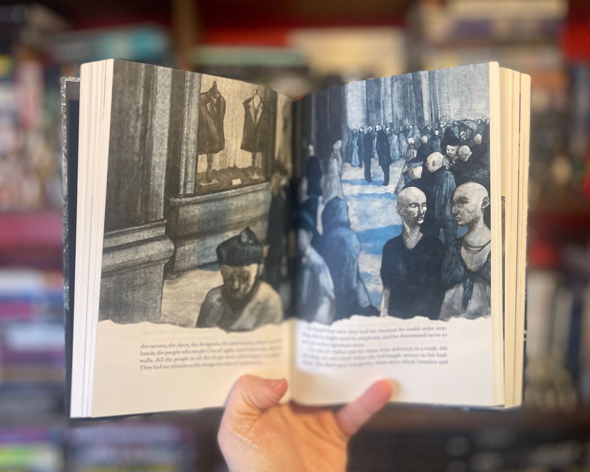
My main aim was to make the imagery of Annares, an earthier, socialist-inspired society contrast with the opulent capitalist society of Urras.
Therefore I attempted to draw the world of Annares as a place where the clothes, people, details and surroundings would be drab and perfunctory as opposed to the more ostentatious façade of Urras and its people and environments. We also used grey scale on the images that depicted Annares and adopted a duotone colour palette to enhance the images of the events that take place on Urras, adding blue to those images. This enabled us to differentiate the two societies with an immediate and simple shorthand visual use of colour.