Anatomy of a cover
Another look at the work that went into designing a book cover
Over at my day job, we have a new book coming out: Life Became Very Blurry: An Oral History of COVID-19 in Vermont. It's part of a larger oral history project that we launched back in 2022 that sought to document the experience and approach to the pandemic here in the state.
As part of the project, we collected more than 100 oral histories from Vermonters of all types: from high-level state officials coordinating the response to folks in nursing homes, contact tracers, essential workers, and so forth. We invited author and journalist Garrett M. Graff (no big deal, just a guy nominated for a Pulitzer Prize for his history of Watergate) to compile those oral histories into a cohesive narrative, which is this book.
My role at VHS is PR & Guest Services Coordinator, which means I run all of our press relations and bookstore, and thus, I've been heading up the effort to publicize and sell this book. I talked a bit about how this worked in a prior post (about last fall's release, Ira Allen: A Biography by J. Kevin Graffagnino) but my role here was a little more involved and hands-on.
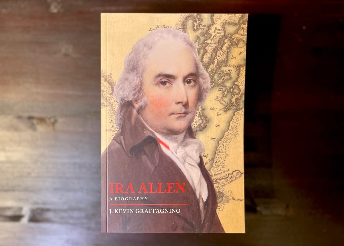
I write a lot about cover art and book covers in general as part of the larger package of bookselling. With Ira Allen, I drew some inspiration from the books that are out there about other biographies of other historical white guys, which basically boiled down to a portrait and some sort of background.
this book presented some interesting challenges for us: how do you convey something like the COVID-19 pandemic to a book-buying audience?
Part of the problem is that the pandemic is now endemic: it's never gone away, and as such, there's not a weird grouping of books that are out there covering this topic. There are the broader histories of pandemics that incorporate COVID-19 as an example of their larger topics, policy / topical books from experts that publishers have rushed out for audiences looking to understand what's going on, and sensational conspiracy books published by cranks.
None of those are quite what we've put together here, but there are some similarities: lots of whites / blacks / reds minimalist covers that lets the title do the talking.

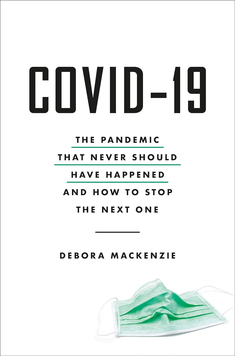
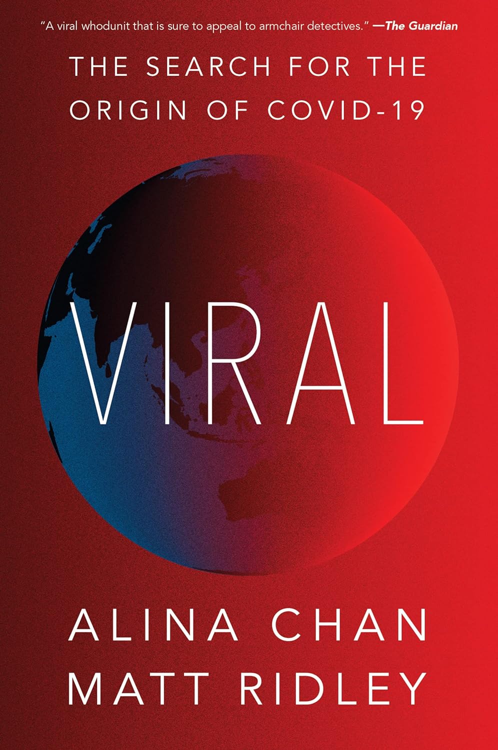
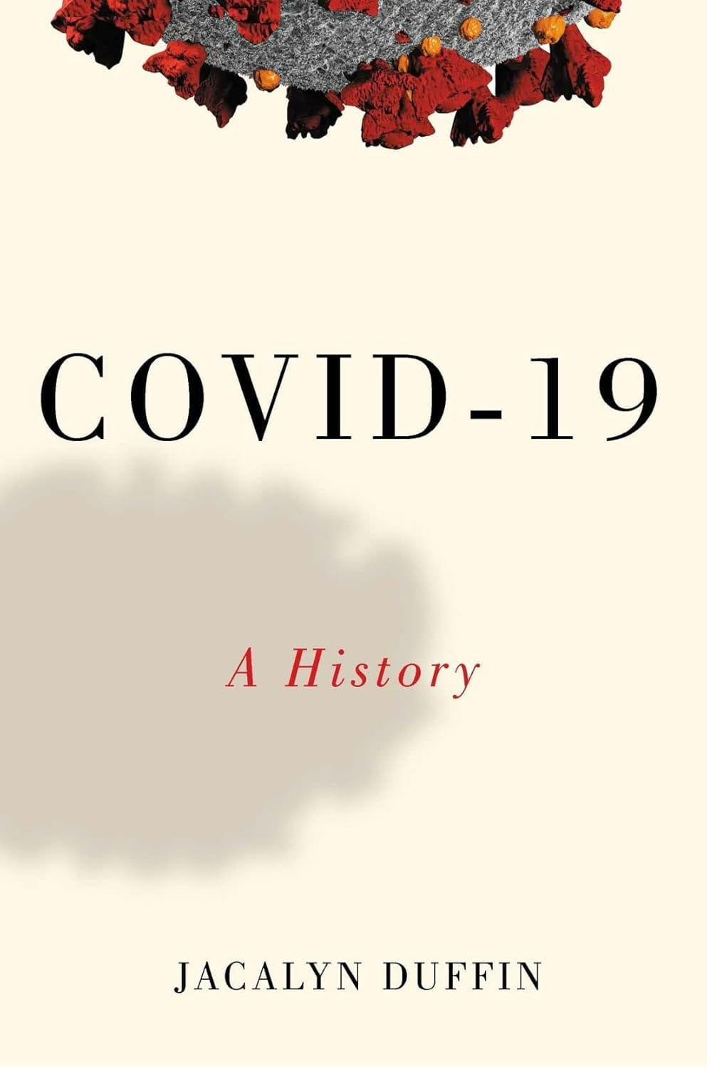
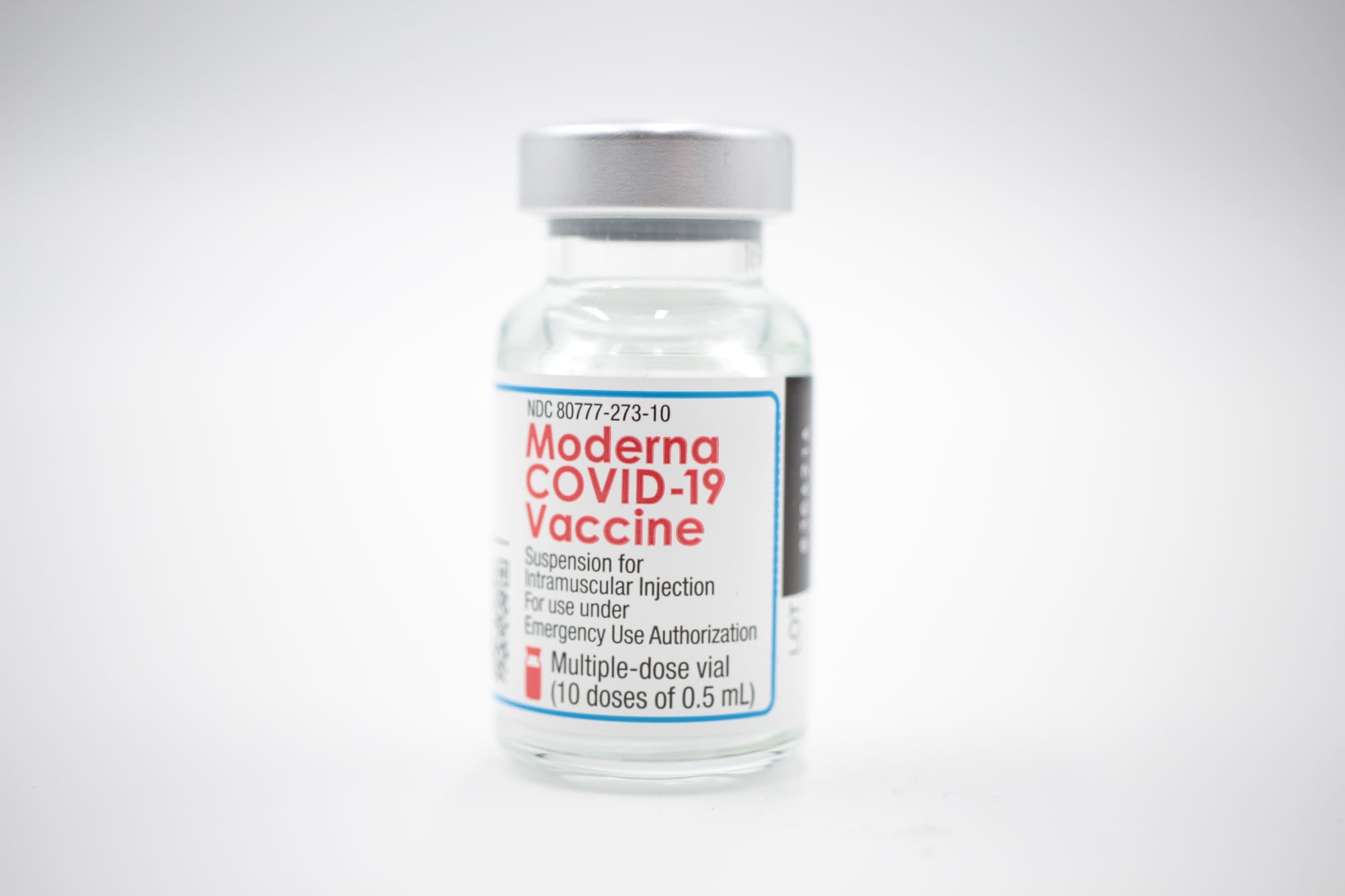
This book doesn't quite fall into those categories, and while we have some items in our collection pertaining to the pandemic, a minimalist cover didn't feel like it quite conveyed what this book was. I wanted to make sure that it wasn't going to be mixed up with a popular science or crank book, with say, something like a photograph of a vaccine vial or a mask.
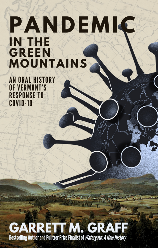
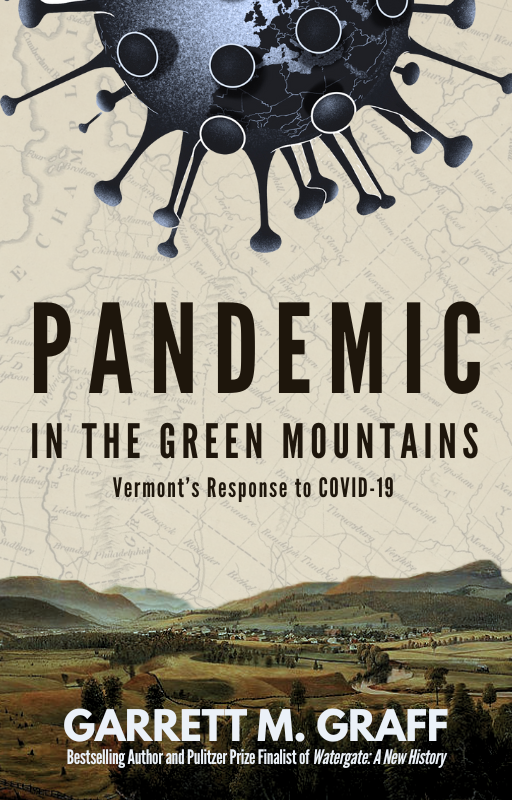
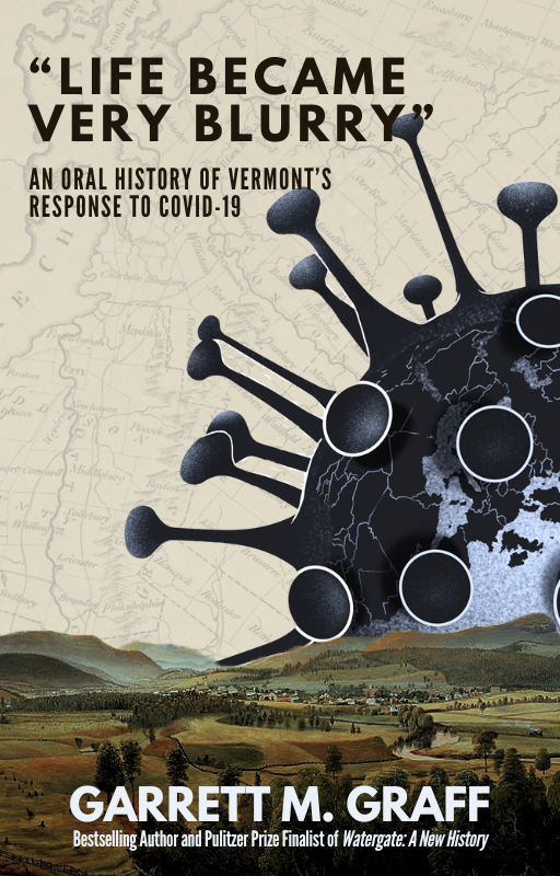
My first thought was to try and put something together that was a bit more historical-looking: I selected some landscape paintings of Vermont and isolated the mountains, and to convey the looming threat of COVID-19, I found a graphic of a virus particle and stuck it up in the sky. In the back, I used a historic map of Vermont.
This version was never intended for publication: it was more a proof of concept to see how folks would respond to it. I particularly liked it, but internally, we weren't huge fans of the COVID virus itself (the feedback I got was that it was "icky".) I also wasn't a huge fan of the versions that we ended up trying with usable features: a realistic graphic of a virus particle clashed with the historic feel to the book, and we ended up ditching this direction altogether.
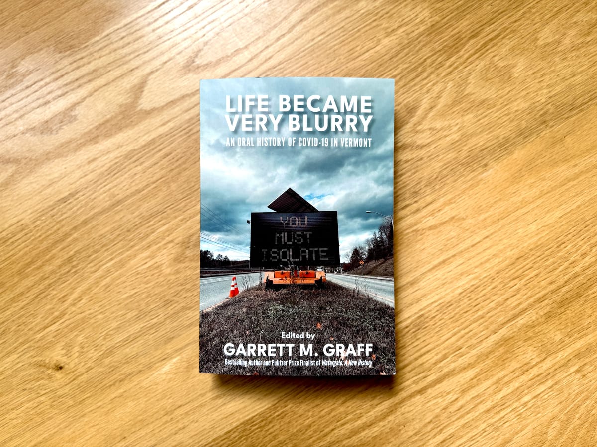
I started chatting with Graff in the fall about his work on the book. "Pandemic in the Green Mountains" started out as a placeholder title, but it always felt a little too sterile and bland for me. Graff had a short list of suggestions based on quotes that he'd pulled out of the manuscript, and the one that spoke to us the most was "Life Became Very Blurry", which came from Dan Daltry, the infectious disease program manager at the Vermont Department of Health. It ended up sticking.
With the historical version axed, I began working up an alternative. At the start of the pandemic, we'd opened a crowd-sourced archive where people could submit their photographs, diary entries, and more for preservation. I started looking through the photos, but I didn't find many that really conveyed what we were looking for. Some where kind of vague, of signs, or weren't positioned well to accommodate the things that a cover needs, like lots of air and negative space. (That's not to say that they aren't great photos: they're invaluable for historical purposes, just not for book covers.)
I realized that I had some photos that might work. When the pandemic began in 2020, I began taking pictures on my walks: images of the signs and indications of the pandemic's impact, and the emptiness that I felt during that time. I had collected them into a folder on my phone, and began flipping through.
Some basic criteria emerged: I needed negative space, something that conveyed the pandemic, and something fairly minimal, but to the point. I downloaded a bunch that might work, and began experimenting with variations.
Images: Andrew Liptak
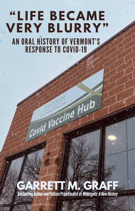
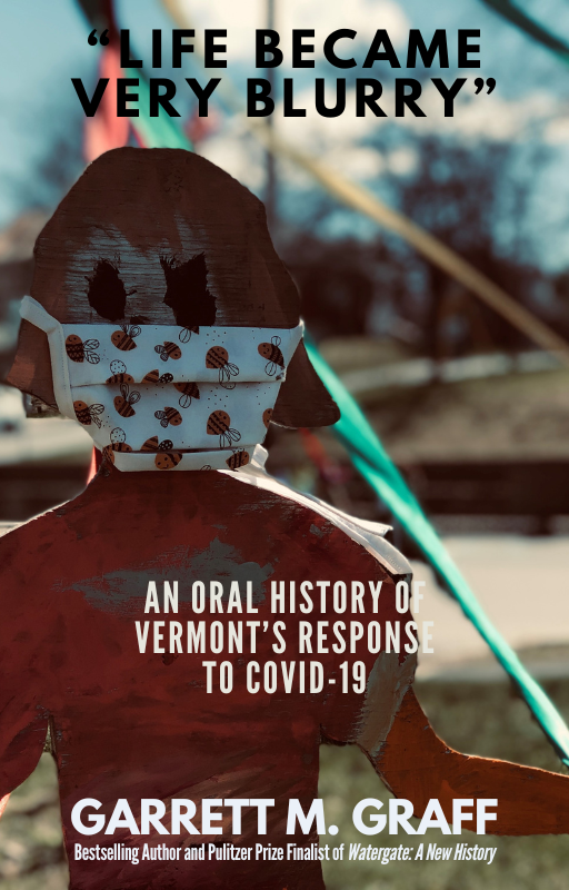
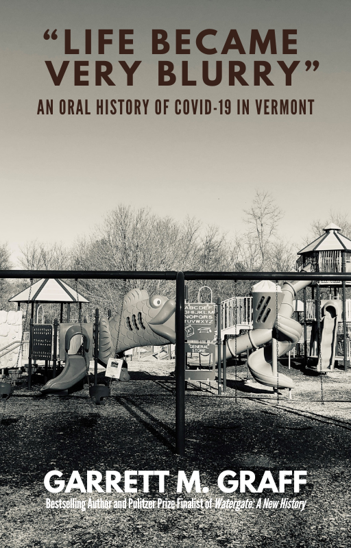
This felt like a better, modern approach that conveyed what we wanted with the book. None of these really worked well for what I was looking for though. The vaccine hub photo just felt bland: there was no urgency to it. The masked cut-out felt a little too creepy, but the background was also a bit too noisy. The empty playground was my favorite of the lot, but it didn't really convey COVID all that well. There's a sign on the swing, but it's impossible to read.
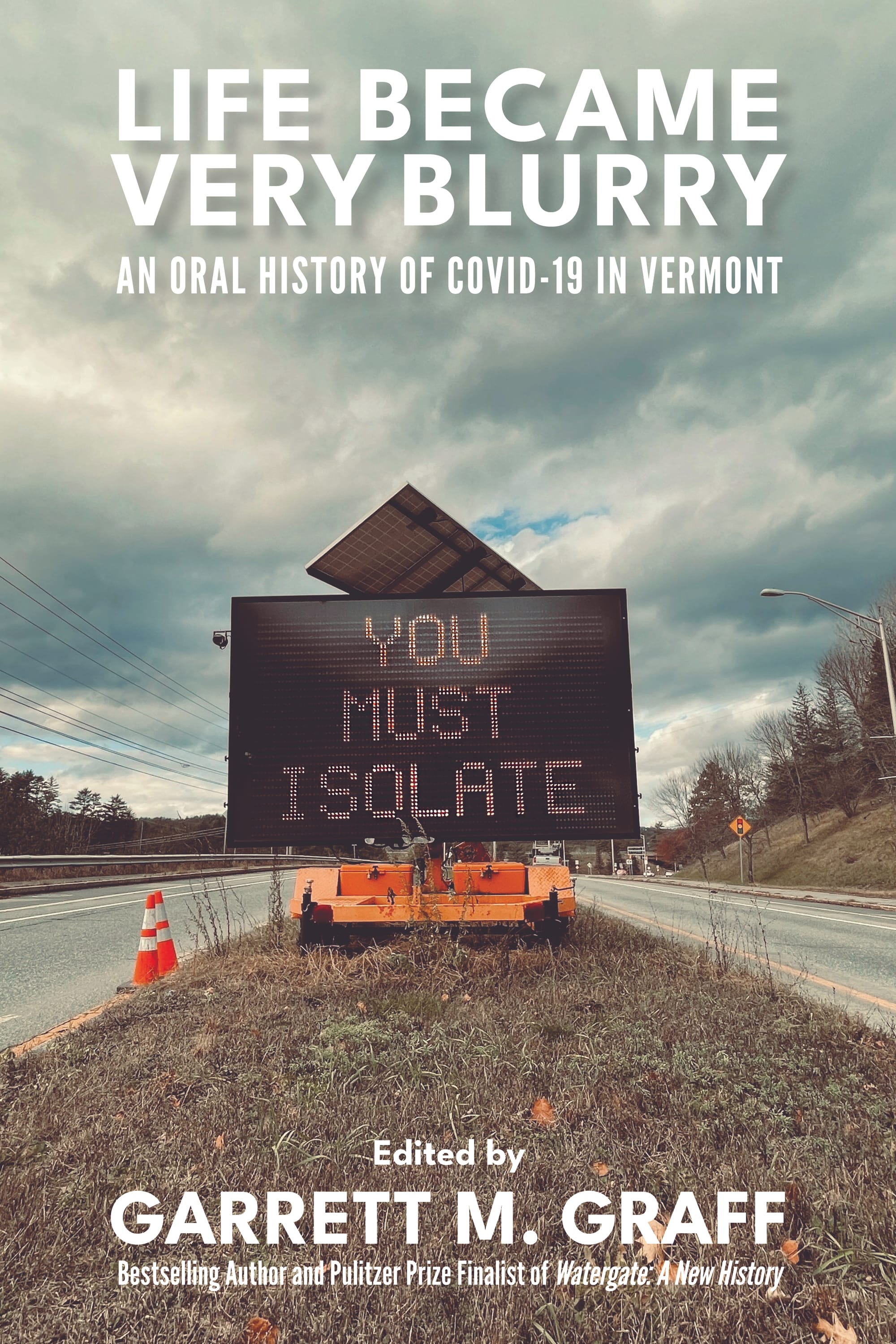
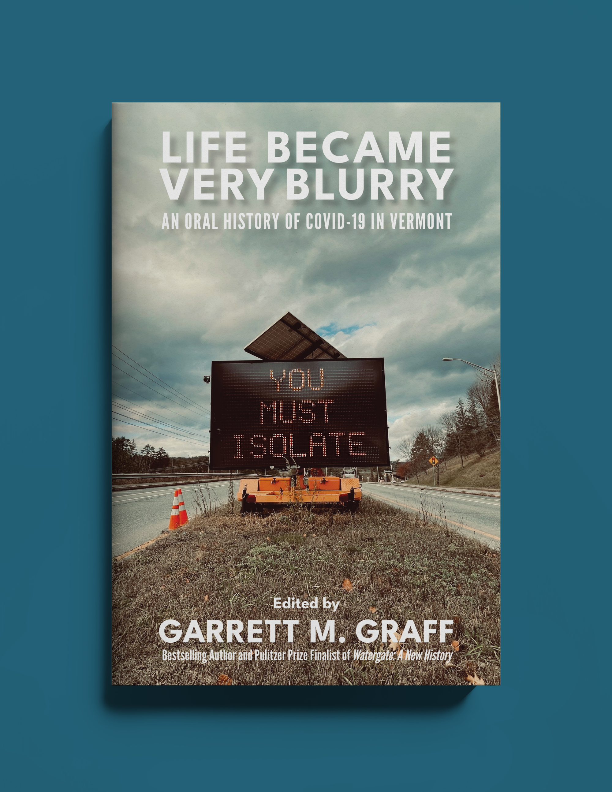
There was an image that popped out for me: one that I took of a sign in Norwich, Vermont on December 1st, 2020, warning visitors to the state that they would need to isolate for a couple of weeks upon entering.
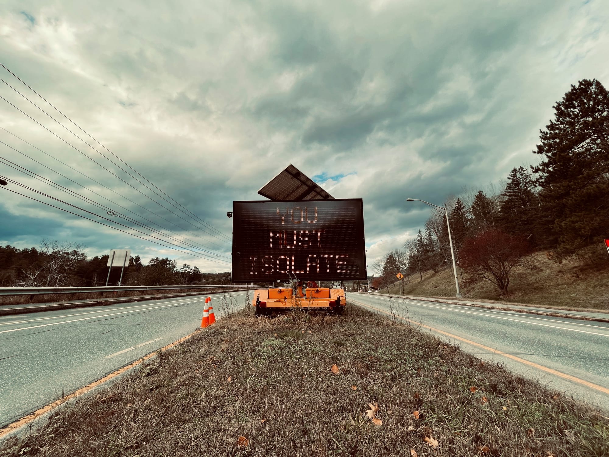
It had plenty of negative space, the subject is right in the middle, and the sign itself is direct and to the point: YOU MUST ISOLATE. Internally, we really liked it, and we handed the concept over to a designer who helped enhance the image on the sign, do the layout and text. We ended up adding some drop-shadow effects to the title and a minimal amount of color correction, and we had our final cover.
Once the image was in place, that allowed me to begin generating some of the images that we'd need for marketing the book: graphics for our social media feeds and website, as well as a short teaser trailer, which I generated in Canva and was a fun experiment.
These all serve different purposes: the one with the blue background is one that we've been using for retailer pages and for social media, where we don't want the book cover itself cropped in a feed. Various banners are used on the website or for thumbnails, and another is a poster that we can physically print out and display at our locations and elsewhere.
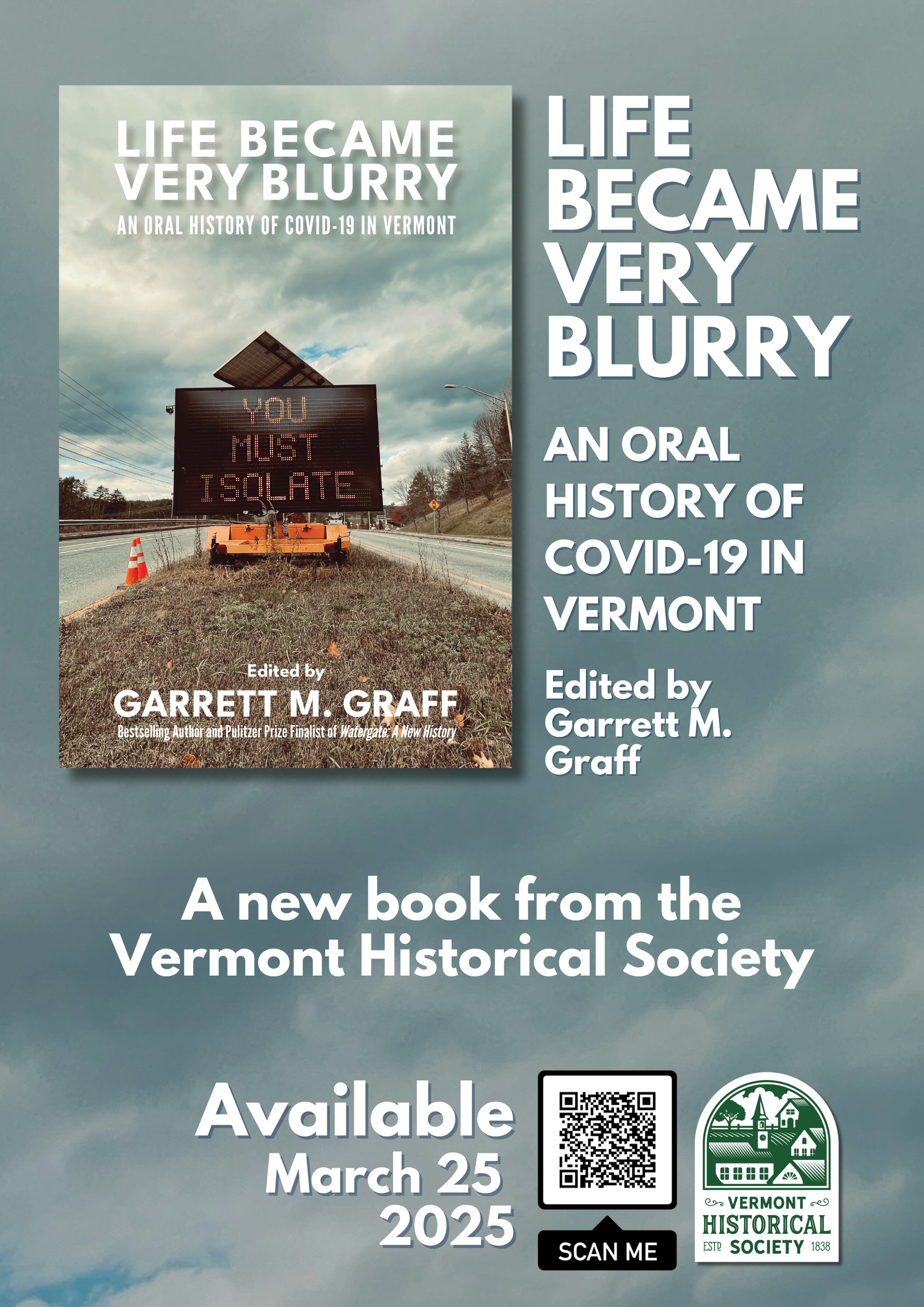
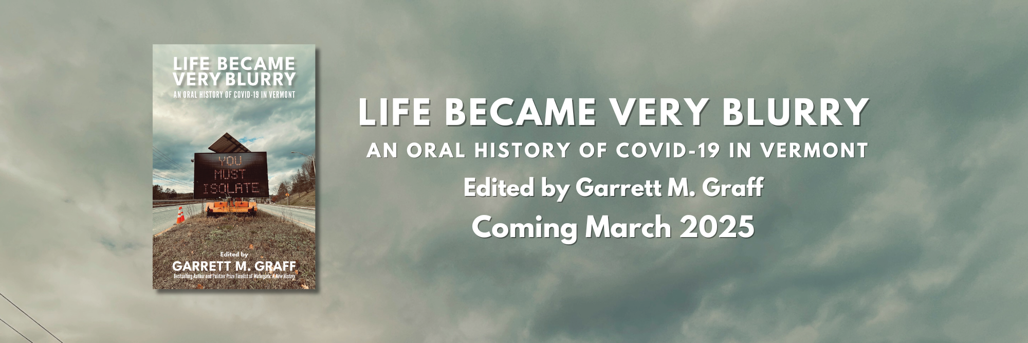

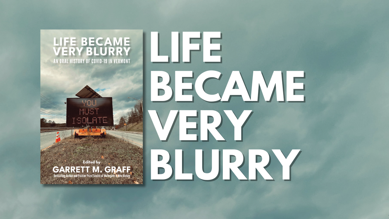
Various marketing images for Life Became Very Blurry. Images: Vermont Historical Society
Now the fun part begins: selling the book to bookstores and buyers around the state. This is the third book that I've worked on for VHS, and it's not quite like the others. The first was "Vermont for the Vermonters": The History of Eugenics in the Green Mountain State, which we weren't entirely sure how well it would do, given the subject matter. But it sold really well (we've had to reprint it a couple of times), and still moves briskly off the shelves here. I sort of expected Ira Allen to be a bit of a sleeper, but it's probably sold the best out of all of our books: we keep running out of it. This one feels like it'll be a bit of a toss-up. It's an important topic, but it's also pretty fresh in people's minds.
I'm really happy with how this came together. Like the Ira Allen biography, this was a really fun challenge to tackle. And now that we have copies in hand and headed off to readers and bookstores, it'll be time to start work on the next book. It's something in the true crime variety, and with that comes new challenges that I'll be working on tackling this spring and summer ahead of its release this fall. Stay tuned.