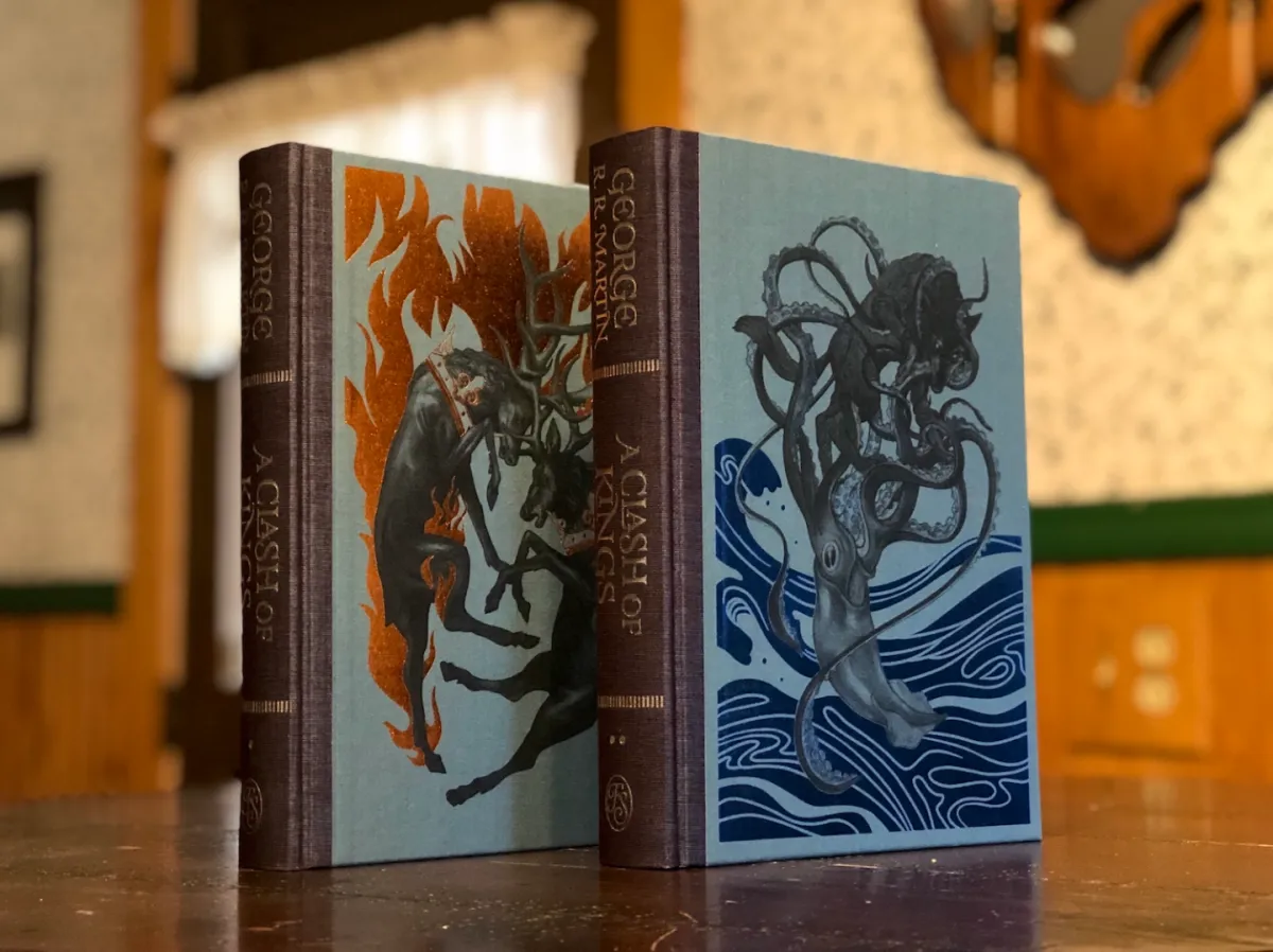
An interview with Jonathan Burton, artist of George R.R. Martin’s A Clash of Kings

Last year, The Folio Society released an impressive edition of George R.R. Martin’s epic fantasy novel A Game of Thrones, with original illustrations by Jonathan Burton. The artist has returned for the Society’s edition of the second Song of Ice and Fire novel, A Clash of Kings, available now.
I spoke with Burton about his artistic process, and what he’s learned since starting with A Game of Thrones.
In the last five years, the publisher has been hard at work producing high-end editions that range from classic works of science fiction and fantasy such as Isaac Asimov’s I, Robot, Arthur C. Clarke’s 2001: A Space Odyssey and Ursula K. Le Guin’s The Dispossessed, A Wizard of Earthsea, and The Left Hand of Darkness to modern works like Neil Gaiman’s American Gods and Anasi Boys.

Illustrations © Jonathan Burton for The Folio Society’s edition of George R.R. Martin’s ‘A Clash of Kings.’
Andrew Liptak: Last year, you provided the artwork for The Folio Society’s edition of A Game of Thrones, and now, you’ve provided the artwork for A Clash of Kings. Before we talk about the artwork, what did you think of the book?
Jonathan Burton: As I’ve spoken about before, I am coming to these novels completely cold having not seen the TV series, so I was excited to see what happens to these characters. I was constantly surprised by the unfolding events and I had a few jaw dropping moments including Melisandre’s true nature and what happens to Renly. The new character of Brienne is a gift. My favorite is Arya with her feisty yet innocent character constantly up against the most monstrous and manipulative.
AL: A Game of Thrones and A Clash of Kings feel like they’re pretty distinctive from one another: the former obviously introduces the world and all of the plot points, but the latter brings in a lot of the political wrangling and rivalries between houses. How did you bring that into your art for this project?
JB: Indeed, the mounting up of political intrigue is great for the story but isn’t visually evocative. My ‘presence’ in these editions is limited so I want to choose things that are dynamic and include some of the more iconic moments from the whole story. Fortunately, there are plenty of plot points where I can show these characters in interesting ways that steer away from the political conversations.
AL: Was there anything that you learned from the process of the first book that you were able to bring in to the second?
JB: A lot of the initial design choices had been made on the first book including how to tackle the bindings, chapter heads and sigils so we had a set style to continue which made the process a little easier.
I also felt more confident approaching this one as I was settling in to the characters and understanding more and more of not so much in how they are drawn but how they fit into the world around them and how I can show their relationship with others that accentuate their personalities.

Image: Andrew Liptak, Art by Jonathan Burton
AL: What feedback did you get from avid Song of Ice and Fire fans?
JB: I’ve had some very encouraging feedback from fans which I’m thrilled about as I try very hard to be loyal to the text and the characters. My conversations with fans show that they appreciate the differences to other interpretations including the TV show.
My first worries were that my work isn’t enough in the realm of ‘fantasy art’, but the first book was very warmly received so maybe coming to these books from the outside is good thing.
AL: What was some of the process that went into creating these illustrations?
JB: As with every book I’ve illustrated the scene selections prove to be a constant juggle. The illustrations need to be spread throughout so not every scene can be feasible. This means trying to make a selection of main characters and settings, iconic moments and things that jump out to me that I can’t stop myself drawing. A balancing act.
Then the process is thumbnail sketches, sketches for approvals, reference gathering, photoshoots with models (friends) then final drawings in pencil and colored in photoshop.

Illustrations ©Jonathan Burton for The Folio Society’s edition of George R.R. Martin’s ‘A Clash of Kings.’
AL: One of the things that I noticed in this volume was that you used different colors to differentiate art for different characters: Tyrion, Arya and Bran all get Earth-ish tones, Jon gets stark whites / blacks, while Sansa gets a vivid greens and reds. What are you hoping to signal here?
JB: I’m glad you’ve asked! It’s a conscience decision to differentiate between worlds and for example I love the contrast between the sisters of Sansa’s ‘romantic’ view of the world and Arya’s gruesome reality. I think Sansa suits a Pre-Raphaelite romanticism, always believing she will be rescued by a handsome knight no matter how grim her circumstances. Arya in contrast is down in the dirt and drawn much more harshly.

Illustrations ©Jonathan Burton for The Folio Society’s edition of George R.R. Martin’s ‘A Clash of Kings.’
AL: Were there any illustrations in this book in particular that are your favorites?
JB: One stand out for me is the scene of Renly’s death, it’s a melodramatic moment where I felt it needed the strong lighting and composition to evoke a classical painting of a major event.
Another is Arya facing up the prisoners in the wagon, I really like how her expression is one of defiance against their antagonizing threats.

Image: Andrew Liptak, Art by Jonathan Burton